(Archive) Advertising District / Dump-Place
-
 19-April 07
-

 Sey
Offline
Honestly some places are overdetailed and messy, others are just bare. I like the glass roofing though!
 -

 SSSammy
Offline
colorado fan, i would definately look to Seys work to help you there. although on the surface it looks very pretty, when you actually take the time to look at it, it comes across as inconsistant, which is a shame, as i LOVE your work.
 -

 Luketh
Offline
Never seen what done before...Siamese peeps? See...one half thinks it's too yellow so he doesn't want to go in and the other is colorblind and doesn't care.
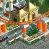
He MIGHT be reffering to the archway he built out of the monorail track.
CF, I really like that... the only thing I could agree with that everybody else has already said is that it looks a little bare on those diaginal sides.. -

 In:Cities
Offline
sorry man, i usually like your screens.
but there is nothing really to comment on here -

 Cena
Offline
I dislike the pink floor, it makes it too 'sweet', nice job on the objects
 One thing I have my concerns about, are the thick walls you use at the top, with the floor under it using only white wooden poles ... A bit more thought into it, and you can make this look good.
-

 Dark_Horse
Offline
Well, I just realized I'm a dummy. Thanks for pointing the flimsiness of it, I will go back and fix it.
 -

 JoeZia
Offline
edit: WTF? this is like the third time i comented on something from way back in this thread. idk why its taking me to the last post on every topic other than this one.
JoeZia
Offline
edit: WTF? this is like the third time i comented on something from way back in this thread. idk why its taking me to the last post on every topic other than this one.Edited by JoeZia, 11 May 2010 - 01:41 PM.
-

 Cena
Offline
Because you go to the last page you have seen before ... That way you can catch up with reading/following this topci.
 -

 Corey
Offline

Be brutally honest please. This is my first try at a "realistic" entrance, and I have no clue what to do from here. -

 magmoormaster
Offline
Foliage looks good. Add some more bushes and things like that though. Grass is boring, I'd switch to the grass/dirt ground instead. Also, change the ground under the path.
I really hope the building's roof isn't finished...
The mine train in my No-CS park.
 Tags
Tags
- No Tags


