(Archive) Advertising District / Dump-Place
-
 19-April 07
-

 nin
Offline
Personally I dislike when inclined path is just left with it's default, bare supports. Maybe spruce it up a bit?
 -

 Splitvision
Offline
Yeah I'm with nin, there are times when they can be left as they are and still look good, but I don't feel they fit here. I really like the little exit doorway though, it's cute.
 -

 Cena
Offline
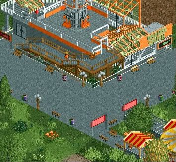
"Though it's just a memory, some memories last forever..."
PS: Ignore the LIIIITTLE bit of brown up there.
That's better.
I like the way you are experimenting with the game plus it hacks, however your results are not good yet, Some colors really clash with each other in the screen. -

 Luketh
Offline
Alright, thanks, Cena. You're telling me that my color choices are bad, but you're not telling me WHICH color choices are bad, or how I can fix it.
The only way I can get better is for you, the people, to tell me what it is I'm doing wrong and help me out here. I'm not gonna kill myself if you don't like it, I just want to improve, help a brother out.
And thanks for that typo fix there, Cena, I was in a rush and as I typed "memorys" I'm like "Man, that looks so wrong.." but I had to go so I couldn't think it through. Just one of those words, I guess. -

 Dark_Horse
Offline
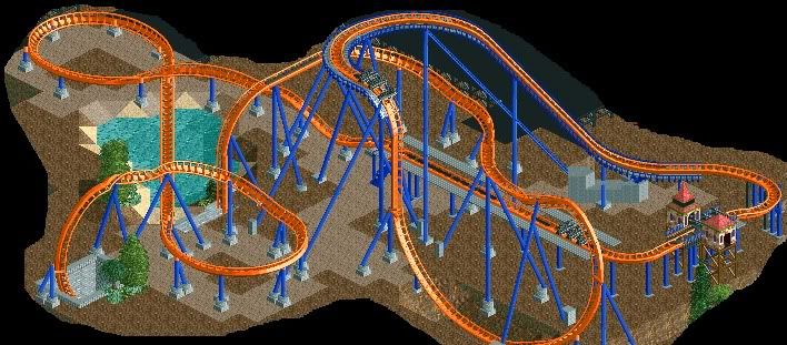
Don't listen to Wanted. He's just being his usual self. Layout seems pretty solid StormRunnerFan, although the beginning reminds me of the one from H2H5 (or was it MM). The colors work really well, but it needs more details. The brake run looks funky, try adding in transfer track and connecting the catwalks. Maybe shorten it too, it seems kind of long at the moment.
Dark_Horse
Offline
Don't listen to Wanted. He's just being his usual self. Layout seems pretty solid StormRunnerFan, although the beginning reminds me of the one from H2H5 (or was it MM). The colors work really well, but it needs more details. The brake run looks funky, try adding in transfer track and connecting the catwalks. Maybe shorten it too, it seems kind of long at the moment.Edited by Dark_Horse, 06 May 2010 - 11:46 PM.
-

RMM Offline
saying he doesn't care for it and preferred his other work? how is that even near being an ass?Edited by RMM, 06 May 2010 - 11:43 PM.
-

 Themeparkmaster
Offline
I like it, the supports are great and it feels very realistic.
However, I think the length of the brake run in relation to the station is disproportionate. If I were you I would have the brake run and station on the same straight section and then have the train leave the station into a long left hand corner, complete with cat walk, into the lift hill.
Looking at it again I think the descent into the second drop should be steeper as well actually. -

 MadraDot
Offline
so i'm trying to make something good for once, its unfinished though
should i improve on my foliage, if so how?
-
 Evil WME
Offline
Hah. Deadmau5! :)
Uhmm.. yeah, try to work out your foliage. You have jungle bushes and very regular trees, everything doesn't seem to fit with each other. Try more of the same 'kind' of bushes and make patches off lush foliage (like in real life)
kudos for making duellers.
Waar heb jij deadmau5 gezien? Vond em op Roskilde adembenemend leuk, maar toen viel ie bij de Paradiso daarna toch wel een beetje tegen. -

 Brent
Offline
That is awesome... reminds me of the weed flower layout that Kulras did years back. I think I still have that SV4 too...
 Tags
Tags
- No Tags

