(Archive) Advertising District / Dump-Place
-
 19-April 07
-

 Dark_Horse
Offline

Just something I'm working on while trying to figure out what I want to do with Starbird. -

 SGT BLOOPER
Offline
@dark_horse - It looks a little boring after the immelman...maybe put a helix after the in-line twist? or right after the immelman leading up to the twist?
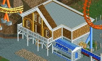
I haven't had much experience when it comes to custom supports, and supporting this element took me a while to figure out...what do you guys think?
-

 Austin55
Offline
You should be able to put in another diagonal support so you dont need so many footers, but otherwise it looks great to me!.
 -

 StormRunnerFan
Offline
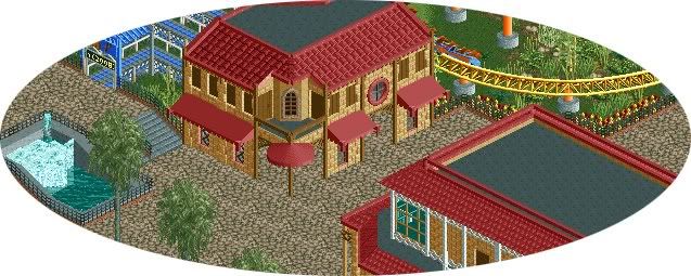
Maverix: Nice little screens. My only complaint is the exit of the tunnel in picture one. For some reason it just looks... odd. Besides that I really like it!
Heres something again:
I'm looking for some opinions on the layout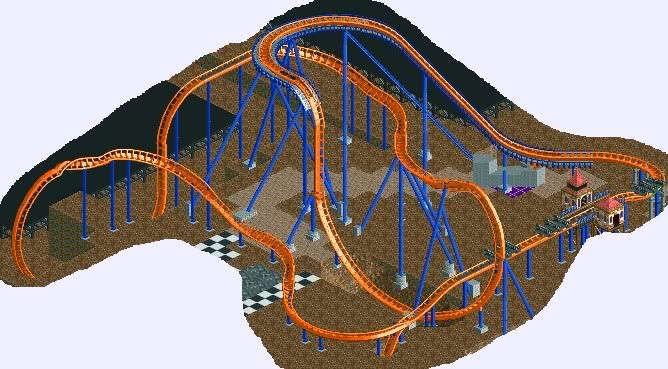
Thanks,
Storm -

 CedarPoint6
Offline
^ I presume you mean SRF's?
Dark Horse: You need something in the middle. I see you're trying to the diagonalish zero g roll, but in this case it doesn't really work. Too much high up track without much in between. You need to maybe consider helixes so that layout is more balanced and not too stretched in parts.
SGT: Maybe a little undersupported. Try adding some on the vertical sections.
Maverix: I'm a fan of that middle building on the bottom screen. Would really like to see more.
SRF: You need something on the end of it. Give it a helix or at least a water splash. Consider SheiKra that does a turnaround, splash, and helix or Griffon which has an airtime hill, splash, turnaround, another airtime hill, and a turn or two before the brakes. Nice job on the making it work with blocks. But I'd just really like you to finish something... -

 Pacificoaster
Offline
Storm: Layout could be better with a water splash section.
Maverix: Looks awesome. Can't wait for future updates.
Edited by Pacificoaster, 05 May 2010 - 12:52 AM.
-

 Themeparkmaster
Offline
^ I take it that's Universal Studios, I like the arch way but i'm not keen on the globe like that, if that's what it's intended to be.
 -

 Louis!
Offline
Dark Horse the layout seems to spread out, and for an ivert with such large elements a longer layout is needed imo.
 -

 Steve
Offline
Pacificoaster, try using the 3D Cinema attraction for the globe, and try and suspend it over a fountain rather than gardens.
I'd also recommend sticking to one kind of path; having all of those there looks kind of hectic. -

 Dark_Horse
Offline
Thanks for the comments everyone. However, I enjoy the layout and am sticking with it. And Top Gun, that's where the inspiration came from
-

inVersed Offline
Everything seems like it lacks detail, and seems like you just threw this together without giving any thought about composition. -

 RRP
Offline
Thats a bit harsh. Id say theres thought there but only to a basic degree. Magmoormaster you should try and think more in depth regarding each item you place. Careful consideration is very important
 -

 magmoormaster
Offline
You mean I actually have to think?
jk
I don't mind harsh though.
I'll just have to totally redo that section. Probably a good thing, its so different from the rest of the park... -

 Luketh
Offline
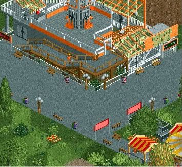
"Though it's just a memory, some memorys last forever..."
PS: Ignore the LIIIITTLE bit of brown up there.
 Tags
Tags
- No Tags

