(Archive) Advertising District / Dump-Place
-
 19-April 07
-

 Ripsaw
Offline
Do not fear thorpe point is still going,its just taking some time, just wanted to get this baby out the way first. Ill see what i can do about the loop, and the Log Flume entrance is under and to the left of Soar's brakerun and the station is below the Soar's station.
 -
 Splitvision
Offline
Nin, I like it, but, er... what is it meant to look like? I really can't tell, sorry
-

 Casimir
Offline
your color balance is perfect.
this screen just raises memories of certain park's and zoo's athmosphere for me. Which I think is exceptional. -

 BelgianGuy
Offline
I just felt like sharing this^^
Hope you guys like it,
Note: bottom left still unfinished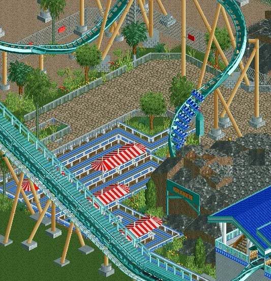
-

 nin
Offline
I would theme the queue more towards ocean life and Kraken in general. SeaWorld's queue is much more interactive and exciting, with aquariums and Kraken's nest (complete with eggs holding eels!). try to make your queue resemble more of it, with cave and scenery and such rather than a simple set up of switchbacks.
 -

 Pacificoaster
Offline
nin brings up a good point. Sea World parks are very interactive with their queues.
 -

 Splitvision
Offline
I don't really like the mix of blue colours in that screen. Also the footers looks a little too random to me. I like those awnings in the queue though.
 -

 CedarPoint6
Offline
In real life, Kraken does not have a terribly interesting queue. It goes through 4 connected building space, raising slightly every time to make it to station level. Outside of some paintings on the walls, there's not much going on with Kraken's queue. But some buildings might help that. Various themed things and such.
 -

 Six Frags
Offline
Ah, Kumba's recreation is catching on eh?
It's always really fascinating to me how fast certain novelties or ideas are copied around NE. Not that it's bad, I do it too myself, but it's just very interesting how this whole "inspiration" thing works..
I like the screen BG, although I always hate that white on the railing of the queue..
SF -

 AvanineCommuter
Offline
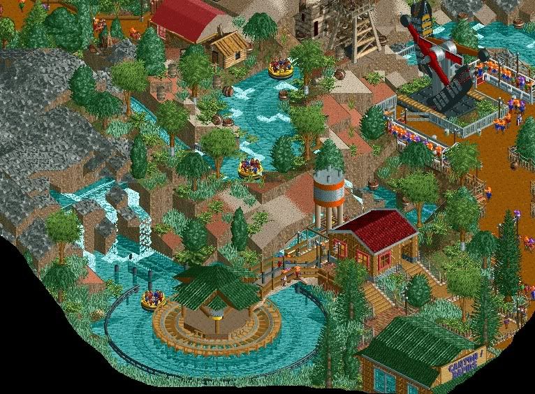
Storm I love the rapids. It's simple but so well made!
I would really appreciate if someone can post a tutorial on making these custom rapids with their rotating stations. I've seen three of them now but I still have no idea how to do it. It looks great! -

 BelgianGuy
Offline
I wasn't inspired by Kumba's rec tbh because it isn't by far a rec of the real coaster, same goes for the screen of the blue flyer, its not a rec of manta. This is just a Seaworld park with coasters that have the same name like the ones in Orlando^^
But I will change up the queue line, maybe add a few buildings and an aquarium but the exit path goes througha cave so I won't be doing that for the queue -

 Splitvision
Offline
That looks really brilliant, storm. You've shwon pics of this area before, right? I recognize the atmosphere. The rapids looks ace.
Not completely finished. From a project currently named "realism? Never heard of it."
 Tags
Tags
- No Tags


