(Archive) Advertising District / Dump-Place
-
 19-April 07
-

 Luketh
Offline
Looks great, BG.
CF, I really like that thing... park must be in America, 'cause only WE are too fat to walk back to our cars. -

Colorado-Fan Offline
There's a transport system like this in Disneyland Paris, too. I hope that I'll get enough screens the next weeks so I can open an own thread for this park. I didn't choose the location at the moment, so I have to think if this park will be located in America. -

 SSSammy
Offline
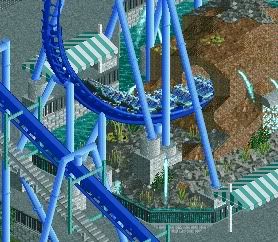
that element looks awkward on its own. not really any flow witht that part, which is a shame, as the rest seems to be nice. other than that there isn't really anything to look at in the screen
BG, i'm with posix, here. -

 Pacificoaster
Offline
Colorado-Fan: Very clean lined and great thought process.
BelgianGuy: Looks wonderful. Hope to see the rest of the layout soon.
Nokia: Maybe by choosing a different color for the invert might bring a more aesthetically pleasing screen. -

 nin
Offline
Nokia, there's really not much 'there'. I know it's unfinished, but maybe add a bit more next time? I realize you've already shrunken the screens so I won't suggest that.
For what is there, there's much potential for more. I'm no good with layouts, but I'm with Sammy here saying that the layout looks a bit awkward, why not just go for a rec of the coaster to keep with the theme?
Also, give the foliage some 'strength' and look like an unmowed lawn with some bushes thrown in. And improve the overall landscaping, make the ditch rocky and 'sharp', do more than just a slight elevation shift under the helix, make it exciting.
Then finally, improve the queue line! That little cover doesn't even fit with the theme of the ride, make it industrial, dark, etc. Fix that huge footer, and just make the area exciting rather than the drab, boring place it is now. -

 BRTeller
Offline
Looks like it does have a lot of potential, but two things that really bug me with both the photos are some of the supports. The one support on the one half of the loop seems to high (it might be the angle of the photo, but still seems high, a notch down wouldn't hurt). Also in the first screen all the footers are level, then the ones for that one support are sprouting up. As for the rest, seems to unfinished to comment on. I do like the layout though unlike the posts above, maybe a few small changes to it would make it better. But I think you can make it work if done right.
BRTeller
Offline
Looks like it does have a lot of potential, but two things that really bug me with both the photos are some of the supports. The one support on the one half of the loop seems to high (it might be the angle of the photo, but still seems high, a notch down wouldn't hurt). Also in the first screen all the footers are level, then the ones for that one support are sprouting up. As for the rest, seems to unfinished to comment on. I do like the layout though unlike the posts above, maybe a few small changes to it would make it better. But I think you can make it work if done right.Edited by BRTeller, 23 April 2010 - 06:38 PM.
-

 BelgianGuy
Offline
I've been knocking some hours on this one and its progressing slowly but steadily,
As you can see its still a little raw but I need some advice:
Since a lot of the caoster goes over the paths I want to place nets for in case a shoe falls down and stuff like that, can anyone make a suggestion how to make these?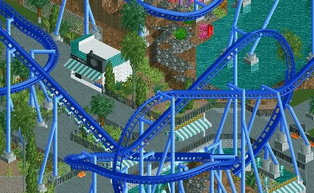
thanks in advance and feel free to post your thoughts -

 Pacificoaster
Offline
Another nice screen. As for the nets you would like to put in, i say leave them out. If my shoe fell off and fell on the path i would be happy i could retrieve it. Just my opinion though.
 -

 Liampie
Offline
I made a net object. Download Dreamworld Indoor.
The screen looks really good but I think it needs some warm colours. Change the canvas awnings and the photoshop and the screen would look even better I think! -

 BelgianGuy
Offline
K I'll check it out liam and thanks for the advice
expect more this has come from... -

 Ripsaw
Offline
Thorpe Point Belton Valley Map
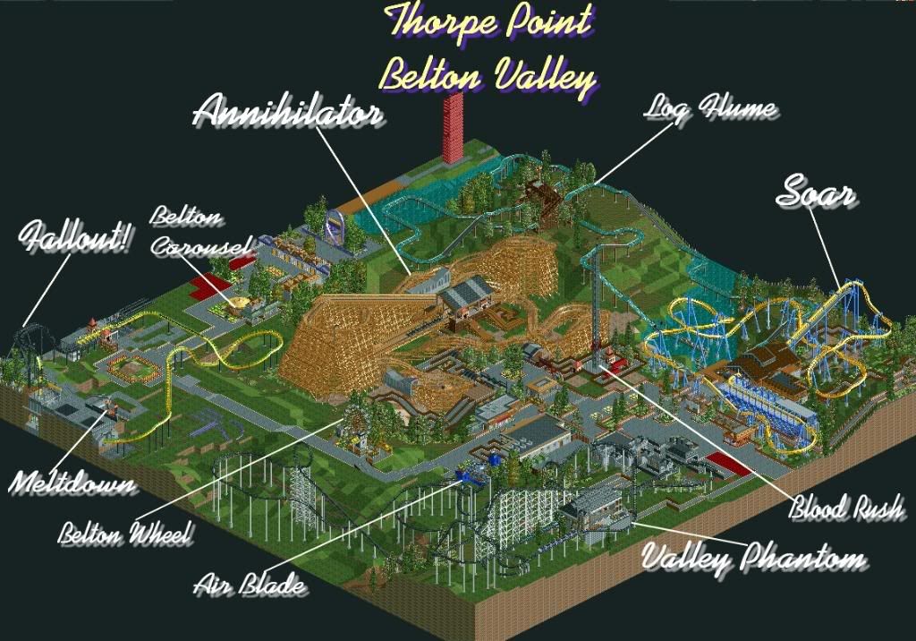
The Entrance lets see if anyone can realise what past project this was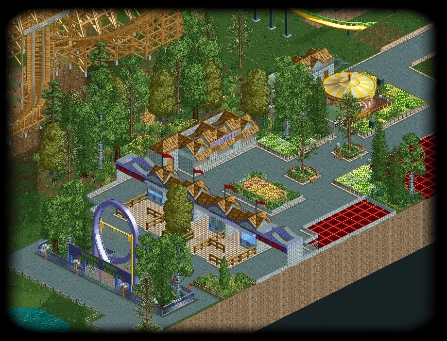
We kept the loop of the original schwartz coaster which Fallout now sits.
Oh and later on i shall release 7peices of work and heres a hint to one of the peices..
Beware the ........Wraith.
Right off to work now -

 Luketh
Offline
That loop entrance sign is probably the coolest thing since sunglasses were invented.
 -

Airtime Offline
BelgianGuy, im a real fan of what you keep showing, but havn't you already done a Manta design or is it being improved? Try to blend those land textures at the minute they look like there in blocks.
Ripsaw nice to see another park! But the overal park layout isn't good. It's too linear and at the far end of path (near the flyer) it seems like the path is wanting to carry on. Maybe take it off the map edge? Is the entrance to the log flume next to the flyer? I love the flyer, woodie, and Arrow really awesome stuff! But the entrance is too square it doesn't have any flow but I think that's due to the awkard placement of the loop, is there any way you place it near the side as in on some grass? Or even just path underneath it like old corky is at AT? The path for an entrance should be no narrower that 2 squares at a minimum. Sorry to point out the negatives but I do really like! I can't wait to see where this goes. OHHH wow! Wraiths! I love wraiths! I really can't wait to see that too!Edited by Airtime, 24 April 2010 - 01:54 PM.
-

 nin
Offline
Wasn't planning on showing this little bit, but forget it. You guys can wait for the finished product..
 Tags
Tags
- No Tags
