(Archive) Advertising District / Dump-Place
-
 19-April 07
-

 Cena
Offline
Because Gee doesn't post anything, I would say you are the best LL / 2 Dual player at this moment!
 -

 Liampie
Offline
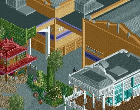
Looking great man, very nice composition! Lost Tours?
edit: No, probably not Lost Tours. I guess I'll have to wait a little longer.
-

 BelgianGuy
Offline
That is as close as it gets to perfection nin,
Best screen I've seen in a long time... -

 Splitvision
Offline
I don't get this screen.
What's inside what's out?
Totally confused right now.
Agree. Seeing it in a bigger perspective will probably help though. Also I dislike the "floating" hedges. I still love that white building though, and the asian building looks equally amazing.
Got some Korean inspiration recently.
-

 Luketh
Offline
I think I can answer the whole "what's inside, what's out?" question.
There are two seperate tan structures that are connected by a tunnel sort of system. I've seen this done in those hollywood studios, as this is, probably so that prop people can transfer props from one studio to the next without getting 'em wet if its raining or whatever. Its also probably so trucks can unload and stuff.
When you think of that middle thing connecting the two buildings as just a little roof, its really not that hard to see what's inside and what's out.
Also, I'd suggest making the slide-up doors grey, Nin. -

inVersed Offline
It might just be me, but it seems like the scale is all over the place in that screen, nin. The pagoda structure in front seems to be built on a completely different state than the massive sound stages behind it. Still, overall this screen is brillantly and the detailing some of the best i have ever seen. I look forward to seeing more. -

 Six Frags
Offline
That's awesome nin.. You're easily one of the best and hottest non-parkmakers atm.. Keep doing what you're doing and try to get it finished. That would be even more awesome
SF -

 posix
Offline
never thought i could like mini objects like in this screen.
tip, to the right of the entrance where you don't have anything yet: put trees. figure out a good tree combo and fill it up. -

 In:Cities
Offline
very classy.
i like it:]
however, i think you should add some depth variation underwater.
by either raising or lowering tiles, or changing the ground type.
also, that fountain seems a little hectic, as does the foliage to the upper left of it.
otherwise, it looks great! -

 Luketh
Offline
I really like that. I'd suggest you use more of the tall grass and less of the 1/8 bush object in your foliage, though. The bush tends to make things look more hectic and I think you're probably gonna want to make the area look more peaceful then it does right now, if you know what I mean.
The rest is pro, though, I love it.
 Tags
Tags
- No Tags


