(Archive) Advertising District / Dump-Place
-
 19-April 07
-

 FK+Coastermind
Offline
the first screen looks interesting but i have no idea what it is. i would try to help you with ideas of how to make it look more like something but since there is no english i dont know what it is supposed to be.
the next screens are okay but could use some detail and some structural diversity.
FK -

 DelLagos
Offline
Great station, Comet!
But the flat roof is a little bit to blank.
I would build a few deco-things on it...
I like to see more. -

 DelLagos
Offline
Here are two new screens from my park, maybe I will create a topic for it in the next time!
It is at the "Italian Job"-Coaster...
Entrance Area
Launch Area
I hope you like it!!! -

 Louis!
Offline
Comet - get rid of the flat-planked roof and make the spanish tiled roof spread the building.
DelLagos - Nice work. The only thing I would change is the coaster track behind the logo. Make it look less random and more organised. -

 Camcorder22
Offline
Assuming that is scenery track and not some sort of stunt jump which actually might be pretty cool, it looks like there is a little too much track and it is too random. maybe one set of hills and a curve would be more organized. Other than that, the ride looks nice, good foliage and the parking structure is cool looking
 -

 JJ
Offline

Sorry about the missing deco blocks and the glitch
Oh and the plant on the roof
Edited by JJ, 23 October 2007 - 09:08 PM.
-

 Louis!
Offline
JJ that's nice. I like the barrels used as pillars and the glass on the building is great. It reminds me of some building I saw in Barcelona.
Been working on this park for a few good months now. Just a small screen: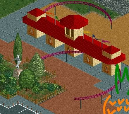
Screen is unfinished near top.Edited by Pineapple, 24 October 2007 - 04:40 AM.
-

 Fr3ak
Offline
Don't understand what those purple things are suppost to be ...
JJ, you're screen is very nice
-

 Carl
Offline
@JJ:
Not sure about the windows on the large gable at the top right of the screen, cause there is nothing behind it; but I guess fake windows have been seen in themepark-theming before...
Also the vertical 1/16th tile colums at the lower left of the screen would look better as brick, or something else with more texture. Although I think brick and castle texture are the only textures that size block has been made in so far, not sure, maybe wood too. But brick would still look best there IMO.
Either way, JJ, you are showing constant improvement. Either that or I had no idea you were this good before
Edited by ride_exchanger, 24 October 2007 - 11:35 AM.
-

 Emergo
Offline
Very nice screen JJ!
The only thing that really ruins it for me is that crown moulding along that roof.
Imo that looks odd and misplaced here.
Does not have any "style-connection" with anything else, especially not with the green wooden roofs. So I would suggest to take a fence or small block that goes better with the wood to align that roof, or even just the simple straight art-deco piece.
Also think it would be very nice (for the unity) to place a green wooden roof on that exit-gate(?) from the whirler, where now is just that flat light brown block.
And what is that cannon doing there?
Does it have any relation to the theme....?
I also fully agree with R_E on the structure of the columns, and don't forget to align that fences, where one is standing on the other tile beacuse of the lamppost....
Otherwise....very nice work!
Emergo
-

 Gwazi
Offline
Looks unfinished near the bottom too. It's actually a little confusing as a screen. lolScreen is unfinished near top.
 Tags
Tags
- No Tags


