(Archive) Advertising District / Dump-Place
-
 19-April 07
-
 Jaguar
Offline
"Who lives in a pineapple under the sea?"
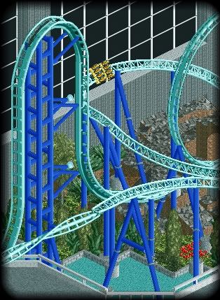
Not a recreation, btw.
Great Idea on that spongebob ride, I was thinking of doing a nickeolodeon universe type thing.jusmith that's awesome.
Something: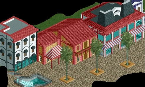
The buildings seem too blocky around the sides. -

 RamSam12
Offline
I've always wondered when we would see something like this on RCT2. Your version looks much better with the theming around the bottom instead of just the concrete pad like the real thing sits on. Really looking forward to seeing more of this."Who lives in a pineapple under the sea?"

Not a recreation, btw. -

 Louis!
Offline
I like it. It's very old school. And I don't think the brown is a problem. I think it works.
Awesome work. Fantastic. -

 GigaG
Offline
"Who lives in a pineapple under the sea?"

Not a recreation, btw.
Woah, great work.
The actual Spongebob Squarepants Rock Bottom Plunge is one of my favorite Minnesota coasters. -

 Sephiroth
Offline
^I actually live an hour north of there.
 I love the new rides that nickeolodeon universe has brought in, but they ruined the wooded theme of the park. The
 BrownOrange Streak? Really? Wonderful screen, by the way. -

 Cocoa
Offline
I'm excited for that jusmith, when I was there I thought of redoing it with better theming in rct2, because it is such a great location and has such good rides...
 -

Airtime Offline
Wow! Gee, posix and gir thanks for the kind words!
Cena I'll have a look at how that works when I get a chance to play.
Themeparkmaster, I didn't think it was that technically good lol but thanks. The roof in screen 1 is a hacked flying saucers ride floor. For your sreen: I really like it but it carries the old LL style in my eyes which is that I struggle to tell building for path/folliage/landscape just a pet peeve. Maybe try using a different path? I dunno lol
BelgianGuy, shame you coudln't hack in a holding brake but other than that it's really good.
Maverix, that's really nice, starting to see great improvments in the archy. Just seems a tad blocky but nice.
Jusmith, I think the barrel role is, maybe, undersupported but I'm loving it!Edited by Airtime, 10 April 2010 - 04:32 PM.
-

 Cena
Offline
I have been spongebobnized at the previous page .... Really guys? Quoting it 3 times on the same page
 ?
?
Ah well, it doesn't matter, it looks good! -

 Midnight Aurora
Offline
Definitely a major improvement over your past work, Lowenaldo. As far as the colours go, I'd say more of the pink. Maybe flip the colour of the spine and rails?
 -

 WhosLeon
Offline
Try to make the quarterblocks more smooth. Looks good though.
WhosLeon
Offline
Try to make the quarterblocks more smooth. Looks good though.Edited by Grabster, 11 April 2010 - 11:01 AM.
-
 Luketh
Offline
I like it.
I do agree with Sam, though.. I think solid purple would be really cool for this coaster.
Grabster, lol, wtf? If that firetruck had wheels it'd be awesome!Edited by Luketh, 11 April 2010 - 11:01 AM.
-

 WhosLeon
Offline
Sorry about deleting the screen i realised you may not show screen of your contest entry yet. (contest on rct-guide).
 Tags
Tags
- No Tags
