(Archive) Advertising District / Dump-Place
-
 19-April 07
-

 Cocoa
Offline
I've seen that happen to me before, but I can't remember how I fixed it... It was in LL I think.
 -

 Louis!
Offline
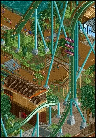
I prefer the first to the second. But I do like both.
As I said on msn, the second lacks refinement, but as this is literally your first LL it doesnt matter
-

 gir
Offline
Wow! I think that's fantastic Airtime. The only issue with the second screen I'd say is the doorway, which just looks messy.
gir
Offline
Wow! I think that's fantastic Airtime. The only issue with the second screen I'd say is the doorway, which just looks messy.Edited by gir, 08 April 2010 - 07:06 PM.
-

 geewhzz
Offline
looked at the screens not looking at the name and I thought gir posted these screens. and that is saying a lot, they look great, keep it up.
 -

 posix
Offline
lacks refinement?
to think how long he had to spend with codex just to get it all that way ...
screens are fantastic, but totally not like what i've seen from you before airtime. -

 Louis!
Offline
I didn't mean majorly. I meant just little tiny things that could be implemented to make it look slightly better. It wasn't a negative comment. Olly knows I think it's brilliant work.
 -

 Cena
Offline
Take the roof structure of screen 1, copy that to screen 2 and make it black. That would look so good!
 -

 BelgianGuy
Offline
I've placed a brake before the slope so it creeps over the drop^^
Didn't feel like merging cuz I wouldn't be able to use block sections that way -

 Themeparkmaster
Offline
Lovely screens Kong and BelgianGuy.
Not really my favoured style of LL Airtime but technically impressive, what is that you've used for the roof there in screen 1?
My weekly dump... -

 Cena
Offline
Lovely screens Kong and BelgianGuy.
Not really my favoured style of LL Airtime but technically impressive, what is that you've used for the roof there in screen 1?
My weekly dump...
I can't see the details between all the brown you have built.
(ps. more colors, I think yellow will look good here)
 Tags
Tags
- No Tags


