(Archive) Advertising District / Dump-Place
-
 19-April 07
-

 Ozone
Offline
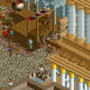
I can't think of anything constructive to say, Kong - that looks fantastic. I really like how you have the steps and the ramp. I like the splash of purple thrown in.
 -

 Cena
Offline
Although the screen is technically perfect and the atmosphere is too, I kinda dislike the amount of glitches.
 -

 RRP
Offline
looks good kong,much better than your old shit.Not sure about the row of trees on the left though.Theres the other tree very similar available for a little variation.Flaming torches always look bad to me aswell
 -
 zburns999
Offline
Damn. One of the best screens I've ever seen. You're up there with the elites on this site as far as I'm concerned.
zburns999
Offline
Damn. One of the best screens I've ever seen. You're up there with the elites on this site as far as I'm concerned.Edited by zburns999, 07 April 2010 - 08:38 AM.
-

 K0NG
Offline
^Other than them being Lakers colors....the only things I've ever done with this color scheme are all versions of the same ride - "Phoenix". It's a ride/theme that I'm apparently dead-set on completing. The last incarnation of this was in "Project-K" which I dumped and it was also in a park I did a couple of years ago that was lost in my HD crash but was actually shown in a fiesta screen last year. So, it may seem like I use this frequently but I really don't.
 -

 Cocoa
Offline
It is very good and there are lots of interesting details, but I'm not sure I like the actual buildings... especially the lower ones.
 -

 K0NG
Offline
If you're referring to the ones with the thatch roof, they're not really buildings. I mean, they're buildings but they're theming for the queue of the coaster. And the center building is a theater so, it's kinda supposed to be the way it is. It's as close as I could get to staying with the Mayan theming without it actually being Mayan theming. Anyway, thanks for the comments, I'd like to start a topic for this but that usually means the kiss of death, so......we'll see.
 -

 J K
Offline
I think it is awesome Kong. I really hope this is your year for releases as we all know you have it.
 -

 RamSam12
Offline
K0NG, that's the kind of screen that defines what NE is all about. Excellent work and keep it up.
 -

 Louis!
Offline
I don't really like the use of the trackitecture as I don't really think it fits here, as in I think it would look better with scenery.
I dislike the light purple for the coaster as well, I think the darker purple would make it look stronger.
But good screen nonetheless.
 Tags
Tags
- No Tags
