(Archive) Advertising District / Dump-Place
-
 19-April 07
-

 GigaG
Offline
Explain these-
The yellow thing is a sign warning boats to request opening of bridge, and to s - curve under the high end of the open bridge
The huts are drawbridge operator booths
The small angled support cirlced in red on the side of the raised bridge is part of the drawing mechanism.
The scale - the bascule (movable section of bridge) is wider than the approaches, as the flanks are the barriers to prevent people from falling into the river as they cross
This the first part of the project, of course there is no surroundings!Edited by GigaG, 03 April 2010 - 06:43 PM.
-

 Austin55
Offline
What about my drawbridge?
If people had something to say, they would say it. Really your not helping yourself. -

 Gwazi
Offline
@gir - wow. love the sign, the brightness of the colors, and the atmosphere
@Loopy - it has class, but it feels a bit too... basic i guess. it looks like something i could whip up in about 5-10 minutes. -

 Casimir
Offline
loopy: I, on the contrary, am very fond of the turn under the first drop.
the only thing I REALLY dislike is the little patch of bare land between the two queue tiles.
GigaG:
If the text was readable at all, I'd comment on it. I'm sure it contains some pretty plausible explanations and I'd be glad to know them. -

 Jaguar
Offline
If people had something to say, they would say it. Really your not helping yourself.
Why, That's Blasphemy! GigaG, that is incredible work, ignore these assholes. That yellow thing(?) looks uhh. really orginal, and I sure wish I had the skill to build small white glass shacks in my park. You are a genious Giga, and I praise you for all your great posts! -

 nin
Offline
I'm liking the 'hidden' restroom but I'd make some sort of border between it and where it meets the path, like a 1/8th tower on both sides of the doors. Also, improve the shrubbery, nothing wrong with being sparse but make it look good.
I agree completely.GigaG:
If the text was readable at all, I'd comment on it. I'm sure it contains some pretty plausible explanations and I'd be glad to know them.
@loopy, so glad to see you advertising again, but like others have said it's very simple, so it better be way unfinished. -

 Jaguar
Offline
@loopy, so glad to see you advertising again, but like others have said it's very simple, so it better be way unfinished.
Nahh, sometimes the simpilar work is the better kind of work.
Sorry about the Sarcasm GigaG, it is just that you seem to be trying to hard. I'd start on a smaller map with no custom scenery. Then I'd try and get it as detailed, (but keep it as flowing as possible!) with no hacks. Then you could release it in the forums. You shouldn't submit it for an accolade because you will end up with disappointment if it doesn't win, you need to play for fun and try and improve if you are really serious. -

 MF72
Offline
Loopy, that's looking amazing. Great job. The only thing I'm worried about, like Liam, is the turn wrapped around the lift hill. Looks like a very harsh turn.
 -

 Louis!
Offline
Loopy that first drop is brilliant.
Nokiaa good to see you back around here.
gir your LL always impresses me. -

 posix
Offline
wow loopy, that looks like a departure from your style to me. but i really really like it. looks very convincing.
nin, the way how you worked in the restrooms into the rocks is wonderful. -

 Comet
Offline
Nokia maybe run a hedge along the side of that land wall up against the path
I think that'd add to the atmosphere a bit -

 Dark_Horse
Offline
Kind of teaser from the first resort I plan to release for The Starbird Project
I know it's missing foliage. I'm working on it. -

 In:Cities
Offline
it gives me a headache trying to look at it.
so much is clashing, its ridiculous.
come on, you can do better. -

disneylhand Offline
I really like those pillars but I'm wondering if they'll look this good from another angle..
-disneylhand -

 MF72
Offline
The building looks awesome AC (if you don't mind me calling you that), however, the only thing I really dislike is that rock structure to the right. Looks extremely unnatural and ugly to be honest. I think once you fix that, this screen would be phenomenal.
 -

 Austin55
Offline
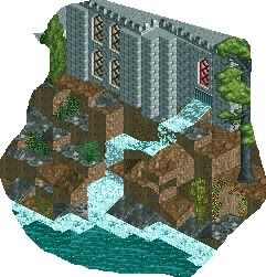
I like the idea of the rocks, especially where you walk through the arch, but maybe if it was refined more. And I dislike those rails on the roof.
Edited by Austin55, 04 April 2010 - 06:13 PM.
 Tags
Tags
- No Tags


