(Archive) Advertising District / Dump-Place
-
 19-April 07
-
 Luketh
Offline
Austin, looks good, I can tell it's six flags-ey at a first glance, so gratz on that.
Remember to keep things at 1-story, not 2 floors, almost every Six Flags dine-in restaruant I've ever seen is really short and wide, with lots of outside dining, which you need more of in your attempts.
Also, elevated outdoor dining (1 "notch" up, if you know what I'm talking about) also seems to be a six-flags thing. Most of the places I've eaten at have that, where you're above the flow of the crowd while you're eating. Either that or a relatively tall fence seperating the path from the outdoor seating. -
![][ntamin22%s's Photo](https://www.nedesigns.com/uploads/profile/photo-thumb-221.png?_r=1520300638)
 ][ntamin22
Offline
Robbie, looking great as always.
Just trying to get my groove back.
as far as rct3 goes i don't think the 'flow' is bad at all. you can only control so much. -

inVersed Offline

Blackstone Group and SeaWorld Parks & Entertainment present...
Kinda late replying, but robbie that's top-notch, first class LL work you have right there -

 Ripsaw
Offline
Just a little peepable walkthrough scaremaze idea i tried in my SixFlags Belgium save
Yes i did add a few things like trying to make the guards bloodied and add some fog but you get the general idea.
Its is based on Field of 1000 Screams at AltonTowers, a walk through the corn to the chaotic frantic finale on the bus with the Zombie siege.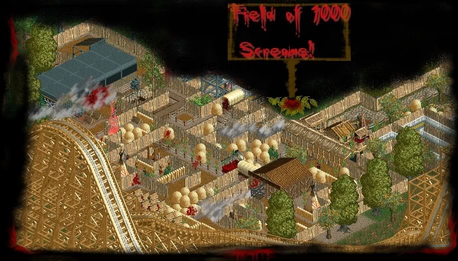
-

 Cena
Offline
I could have liked it ... but the paint editing makes it really look bad. Ripsaw, everyone can see you are good at this game, but how you present it makes it look ugly, atleast it does for me.
 -

 nin
Offline
That's really good, I'd imagine that the roof top wouldn't be so clean and empty however, but if it's just a facade than it may just be located behind it?
 -

 Steve
Offline
The saloon looks great, Rob, but I would lose the wooden fence on that water tower; doesn't seem to fit at all to me.
 -

 Liampie
Offline
Robbie, the sign needs to be higher. From the path noone would be able to read it, however the sign is useless because even if you can't read even the biggest idiot could still figure out it's a saloon.
 -
 jusmith
Offline
robbie that is actually one of the best screens I have seen, ever. I'm wondering what it would look like if you lost the sign all together, though, it seems a bit distracting...what is this from anyway?
 -

 BelgianGuy
Offline
Nice screen robbie, I can imagine myself walking there,
Coasterfreak, its looks a bit bare and the yellow fences ruin it for me tbh because it distracts from the nice little building you have there
Anyway here's a little screen since nobody reacted on the last one^^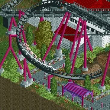
-

 nin
Offline
I'm not sure about the fence around the queue, the rope idea doesn't seem to be working too well, and maybe change the catwalk color to black to seem as a part of the track rather than what it id now? Other than that it seems really nice, keep going with it!
 Tags
Tags
- No Tags


