(Archive) Advertising District / Dump-Place
-
 19-April 07
-

 RRP
Offline
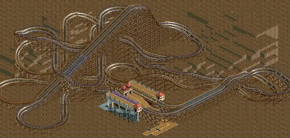
I would like some comments on the layout if that's possible.
Thanks
-Storm
use small turns when the ride is travelling slow.It feel like youve used the large and largest turns far to much when they arent needed -
 JoeZia
Offline
that my friend is a typo, i make a lot of those things.@nin - i totally agree
@JoeZia - it's "Quartz" not "Quarts" -

 SSSammy
Offline
i dont know about you guys but i've been having this internal conflict recently about which game i love more
 the graphic of LL can be so breath-taking and fun, but the sheer magnitude of possibilities in RCT2 is just inspiring. very good screen, robbie. we should consider doing something together at some point. is it peepable?
-

 SSSammy
Offline
the flow in that is fucking aweful. i know its the game, but god damn it. try it in rct2 or 1 and you may have some luck.
by the way, those ne awards sig banners are fucking amazing. -

 turbin3
Offline
Really good, robbie, I really like it.
Hope to see more soon!
EDIT:
^^Sammy is right, the flow is really bad. -

 nin
Offline
Yeah, MF, is there any way that you could smooth the transitions out a bit? I get what you're aiming for but there's got to be a better way.
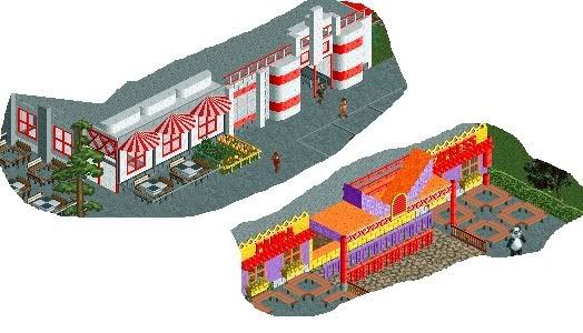
And robbie at first I thought it was ncso and got happy. Either way it's still really good, but I don't see a point in those little tents in the pathway. -

 jusmith
Offline
I could probably do without an asian themed screen for a while, now...the form on the middle building is nice though
-

 MF72
Offline
Thanks SSSammy, Turbin3, and nin for the advice. I know it looks bad, but there's nothing I can do about it. Like I said, I'm just trying to get back in my groove, but apparently I haven't gotten it back. I'll try more layouts to see what does and doesn't work.
 -

 nin
Offline
The castle walls in the 3rd screen are way too flat and empty to look good, change them up, add details, etc.
 -

 JDP
Offline
Missing a red pole on the right side of the second screen.
However I think if me and you did a duo, no one will be able to tell who did what.
-JDPEdited by JDP, 16 March 2010 - 03:37 AM.
-

 BelgianGuy
Offline
Just some small little thing I'm working on...
"I just don't know to handle it" -Crona-
"You could just simply kill it"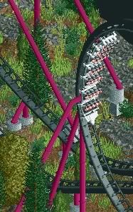
-

 Austin55
Offline
Yea, Im also missing benches and interiors but there is a reason.
I guess Ill take that as a compliment though, you have been one of my primary inspirations so far.
 Tags
Tags
- No Tags


