(Archive) Advertising District / Dump-Place
-
 19-April 07
-

 Sulakke
Offline
Just take a normal color like grey or something.
I really like that screen by the way. Keep it going! -

 BelgianGuy
Offline
What do you mean with someone else's style? I never copied or nothing and in all my screens I've been going with this type of style so I don't really see what you mean posix
 -

 SSSammy
Offline
yeah im curious what you mean there posix.bg, looks like you're following someone else's style. what happened to your own?
-

 BelgianGuy
Offline
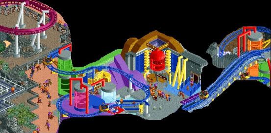
Oh just you wait posix cuz there's a lot to come and in pretty much all of my previous screens there was a coaster so that might do something aswell since I'm still a ride based builder where the coaster pretty much dominate the screen^^ but I'll try to make things look a little more "me"
 -

 Cena
Offline
No, look better (top left corner, threw the glass / a bit above the roof).invisible station?
-

 Camcorder22
Offline
Stuff in the middle is cool, but the transition is awkward. The stuff on the left just looks bland because of that. With a theme like that you'd need a body of water or something to separate it from the other areas.
 -

RMM Offline
i never understood why people crop out unfinished parts of screens. it ALWAYS makes the screen a bitch to look at.
... so with that said... i think it sucks.Edited by RMM, 09 March 2010 - 06:51 PM.
-

 Cena
Offline
Yeah, that pretty much sums it up for me.i never understood why people crop out unfinished parts of screens. it ALWAYS makes the screen a bitch to look at.
... so with that said... i think it sucks. -

 Gwazi
Offline
does anybody happen to know how to get rid of the chairlift support in the center here? i'm having some issues and i'm rusty with the technical stuff especially
also if you have any better ideas for the supports they would be much appreciated. i don't want to cover the waterfall/rapids very much but i want to support the bridge a bit more than just on the sides and i'm having some issues getting a good idea going. -

 wheres_walto
Offline
jesus JoeZia, that screen was from weeks ago. I posted before mastering the invisible hut hack.
 -

RMM Offline
just delete them? not sure what you mean gwazi. why not just have the chairlifts go flat under the paths?
and maybe build some wooden coaster type under the path to look more supportive?
 Tags
Tags
- No Tags


