(Archive) Advertising District / Dump-Place
-
 19-April 07
-
![][ntamin22%s's Photo](https://www.nedesigns.com/uploads/profile/photo-thumb-221.png?_r=1520300638)
 ][ntamin22
Offline
I don't know if its the maroon (actually I'd say thats more of a fuschia
 ) but there is certainly a lot going on there. I think whats missing is some sort of baseline for all of the bright colors to rest on- I think, for example, that changing the grass to dirt,sand, or path would help make a large neutral-toned area and calm things down.
-

 Liampie
Offline
Maybe there's indeed too much purple, but I need to see more to be sure. I see some nice ideas, but it doesn't come together as a whole well. I think changing the bridge's stairs into something brown will make it a lot better. The glitches on top of the bridge don't help either.
Still a very nice screen though, I'm looking forward to more. Glad to have you back, even though I joined after you left. LLLL! -

 Liampie
Offline
Fountain obsession!
Nah, it's pretty cool, but I strongly dislike the tent. A normal control booth would look better and more logic. The colours make no sense either. No complaints otherwise! -

 SSSammy
Offline
i feel like i should like it, but i just don't. there is something missing. maybe you should get rid of that fountain. i know its just water but in the game it is blue so it is is another colour which adds to the mess.
 -

 Maverix
Offline
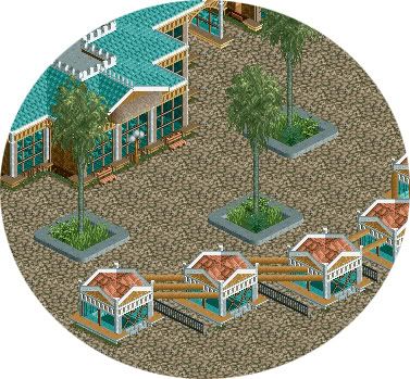
I got 8cars to work and downloaded gee's bench, and have been messing around today and here's what I got. It's a Florida Everglades/ Swamp theme.
Edited by Maverix, 06 March 2010 - 06:18 PM.
-

 That Guy
Offline
Cena, some foliage between the queue and woodie would look better, and the fountain looks weird because of the 2d, those fountains really only look nice when you have 1 or 4.
On the other hand I'm really liking the flowers and dam (or whatever it is) in the background. -

 Louis!
Offline
TPM that is looking really good. Agreed with everyone about the mass of fuschia but when you look past that it is really solid stuff.
 -

 Comet
Offline
That's great Maverix
For some reason I really like the way it looks with that bit of grass between the path and building -

 Cocoa
Offline
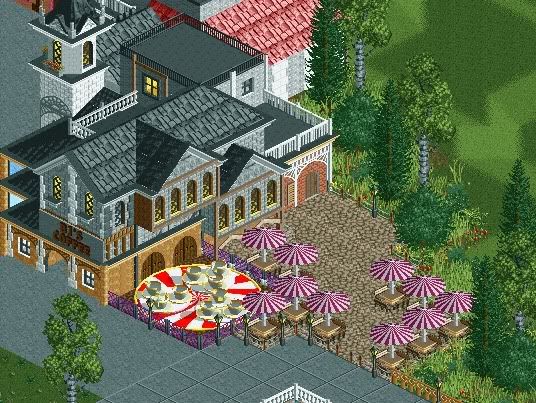
I missed the fiesta on a trip to washington so here you go, two old screens of asterix. sometimes I look at this and want to finish it, but I just don't know where to start, and I just plain don't like large patches of it.

-

 Liampie
Offline
I really like that. Tear down everything you dislike and redo the parklayout in the empty patches. It may give you new inspiration.
 Tags
Tags
- No Tags


