(Archive) Advertising District / Dump-Place
-
 19-April 07
-
 Goliath123
Offline
I love it! I have 1 suggestion that would really benefit the path but would take a bit of time. Rotate the exit so that the path runs along side the ride and not directly onto the path, it takes up too much space at the mo.
Can't wait for the design and your next pic, im lovin everything your showing, your the one who inspired me for the SF park i just started!
I really like your more recent work now. -
 Splitvision
Offline
^
One suggestion though, maybe you should try using quarter tile land blocks for the ice formations? Or atleast in some places, like where the raised tile behind the train is, it looks slighly unnatural as it is now.
Maybe you could try something like this? It can be done much better, I just did this quickly
-

 BelgianGuy
Offline
Cena that looks really bad ass if you ask me, I can't wait to see this ingame, nice thing with the icy falls, really like it
 -

 Cena
Offline
Don't worry Splitvision, those quarter tile ice blocks will be used with this ride
 . I only have to import them with Parkdat yet, that is why you don't see them.
JK, Thanks buddy , I might send you the file again somewhere in the future ... You can help maybe on this area (you know what area this is, I hope?)
Thanks BelgiumGuy, I hope you have a bit of patient tough, the rest of this 180x180 map is kinda unfinished, haha. -

 J K
Offline
Yes I do, I knew straight away what it was. Good shout split it looks natural and the coloured rocks really boost that ice formation. I have this as well in a tryout for a park. I'm not sure if it's going to develop into anything yet.
 -
 turbin3
Offline
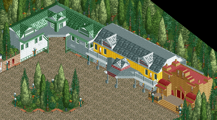
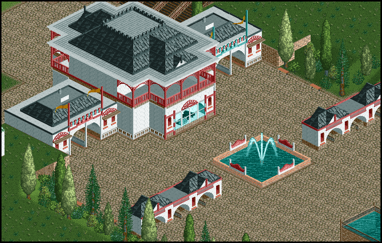
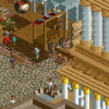
First screen looks good, I just don't like the house on the right, doesn't fit.
Second screen looks cool, just add some more things to the path.
---
~ LLLL ~
w/o codex
-

 Liampie
Offline
I started playing RCT2 again after a very long time, and finding it difficult to get back into.. I started playing around with ideas and came up with this:
I know its unfinished but do you think its worth continuing? I'm my own worst critic
Besides the unfinishedness something about it bugs me and I can't place what it is.
I agree with the previous criticism, and I'd like to add: Dare! I like it, but I feel your style works better if more extravagant. What happened to Haze (I think)?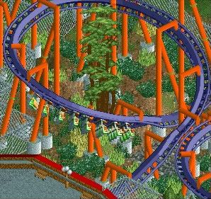
-JDP
I usually hate orange with green. The green in the supports and the tree looks awful, so does the red stuff. No complaints otherwise, I'm really looking forward to seeing some theming.
What happens when you have all the Harry Potter DVDs on hand...
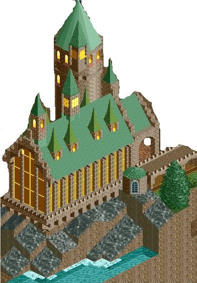
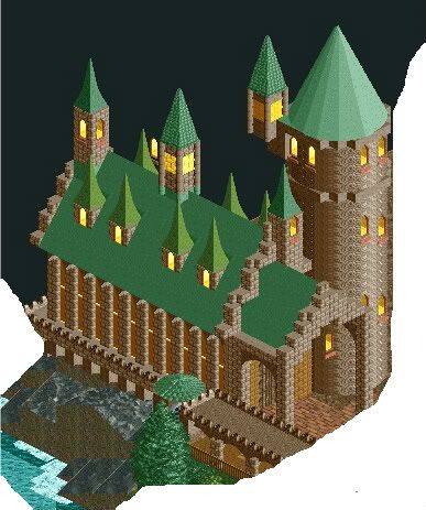
-Storm
First I thought "wow", but the longer I look at the screen the less I like it. The shapes and colours are great, but it needs some more refinement.Sadly, it's me again.
Thanks for them comments. That was just something to keep me busy while I worked on some other things. Gosh do I love multi-tasking!
Well, here's something else: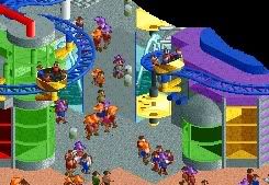
-Storm
I have no idea what it is but it looks cool anyway. I'm really looking forward to a release by you, you improve incredibly fast!Awesome, Robbie. I'd make the trunks of the palm trees grey though.
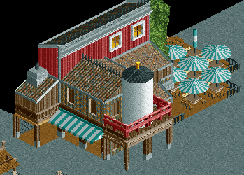
You should've included more foliage in the screen, but still, fantastic! Clean but detailed, exactly how I like it.
Only a teaser for now.
I think you should change the outer ring of the top of the footers grey.One suggestion though, maybe you should try using quarter tile land blocks for the ice formations? Or atleast in some places, like where the raised tile behind the train is, it looks slighly unnatural as it is now.

Maybe you could try something like this? It can be done much better, I just did this quickly
That looks pretty good actually, better than I expected.
~ LLLL ~
w/o codex
Not bad at all, but still not perfect:
- Too much shit on the path
- No clear theme
- No eyecatcher
Looking forward to more! -

 spartan
Offline
I actually like that although I'm not really feeling a Disney or Orient theme. Also I would remove those wheels in the top middle that are blocking the door.
~ LLLL ~
w/o codex
-

 JDP
Offline
I usually hate orange with green. The green in the supports and the tree looks awful, so does the red stuff. No complaints otherwise, I'm really looking forward to seeing some theming.

Yeah that screen is incomplete and things are redone such as the bridge and area where the coaster flows. It was just an idea of what the areas would look like. Thanks for the comments though and everyone else who made one.
-JDP -

 turbin3
Offline
What do you mean with that?^I agree, LL is really where you're at.
Thanks for the comment though.
 Tags
Tags
- No Tags
