(Archive) Advertising District / Dump-Place
-
 19-April 07
-

 That Guy
Offline
Storm, the colors are off, and it looks pretty small unless you're going for a miniature. I would go for a full scale but hey it's not my project.
 -

 Cena
Offline
You couldn't have done it yourself better, so shut up.No offense you ruined harry potter
Stormrunner, it looks pretty cool, but my making it bigger and using other roof objects, I think you can get a more accurate building. Good luck. -

 Goliath123
Offline
Cena you dont know what im building on.
It has to be much bigger, at least 8 rows across for tab;es and walking space, the back part for the teachers table is elevated, there is a door at the back, in the 4th book Moody and Hagrid come through it. Theres more faults then this but i don't think your recreating Hogwarts, so i'll stop.
Im just sayin' -

 nin
Offline
well good thing thing hogwartz is magical or that would be a problem now wouldn't it?It has to be much bigger, at least 8 rows across for tab;es and walking space, the back part for the teachers table is elevated, there is a door at the back, in the 4th book Moody and Hagrid come through it. Theres more faults then this but i don't think your recreating Hogwarts, so i'll stop.
-

 StormRunnerFan
Offline
Sadly, it's me again.
Thanks for them comments. That was just something to keep me busy while I worked on some other things. Gosh do I love multi-tasking!
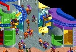
Well, here's something else:
-Storm -

 Liampie
Offline
Yes, that's one of the best climbing walls I've seen. I would look better if higher though, I think.
 -

 In:Cities
Offline
yeah man, it needs to be higher.
about twice as high in my opinion.
oh and srf, that harry potter thing looks great.
as does your other screen:]
i like them both a lot.
goliath, you ruined australia -

 Goliath123
Offline
Maybe if you were to add a little seat for an employee with an umbrella and a cash register it would look even better. You know in a corner or something?
Looks good though, id love to see that building in the bottom right though.
Is it peep friendly?
 Tags
Tags
- No Tags


