(Archive) Advertising District / Dump-Place
-
 19-April 07
-

 Maverix
Offline
The only thing I dislike about the layout is that Mid-Course brake run thing, it totally kills the flow IMO, just replace it with some bunny hills or one big hill and a nice banked turn and your good.
 -

 geewhzz
Offline
Looks like something that will get finished, and I'm very happy about that.
i thought the same thing about taxi and southport -

 Liampie
Offline
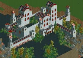
Architecture is good but a little boring, foliage and atmosphere are excellent. Actually I rarely see foliage this good in LL!
 -

 RRP
Offline
looks nice ozone.Got a very gloomy feel to it. Id change the steel to rock for the wall colours though
 -

 Cena
Offline
Liampie, is this inspired by a real thing? I would like to see that if it was so. One concern I have (and therefore asking for above) is the white guidance rails, I would say, try them in black, maybe it looks a bit better (more contrast with the already exsiting white/grey in the picture).
 -

 posix
Offline
ozone, it looks nice. i love the spiked wooden track rooves. i would do all the rooves like that. wooden track for wall walkway is a little out of place. i think regular path would do better.
foliage on paths has never quite convinced me but i know you've been a great fan of it.
liampie, it's great. totally agree with rrp. i suppose the bumps are meant to represent a soft height variation? -

 Louis!
Offline
^much better than the original screens you showed me
Ozone - that is awesome work. I'm not keen on the wooden roof colours though. Also I love how the foliage covers the path edge, brilliant work. -

RMM Offline
ozone, i think some adding some dirt near the foliage on the paths would look better than just straight path. just to give it some transition. -

 JDP
Offline
It's great Liampie and I understand why you have the bumps. I wouldn't have a draw bridge with out it. Nice touch.
-JDP -

 jon
Offline
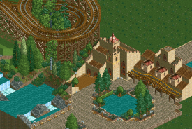
I started playing RCT2 again after a very long time, and finding it difficult to get back into.. I started playing around with ideas and came up with this:
I know its unfinished but do you think its worth continuing? I'm my own worst critic
Besides the unfinishedness something about it bugs me and I can't place what it is.Edited by projekt, 24 February 2010 - 08:14 PM.
-

 geewhzz
Offline
right now the brown path clashes badly with the sides of the buildings and the wooden planks under them. make a more defined line from where the floor stops and the buildings start. other than that seems like a good start.
 Tags
Tags
- No Tags
