(Archive) Advertising District / Dump-Place
-
 19-April 07
-

 Splitvision
Offline
^.
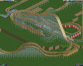
It's fantastic, and as Disneylhand mentioned it has a Geewhzz vibe to it. My only gripe is the red coloured bricks, I've never liked that colour and less so when it's combined with brick texture. -

 Cena
Offline
Wow, that really looks good, however, I don't like it to be honest, I am more a themepark guy then a coaster guy I think, nothing you can do about that Robbie
 .
.
-

Colorado-Fan Offline
@Welshcraft: I really like the station of the coaster. The supports look nice, too, but I don't like the layout so far.
Edited by Colorado-Fan, 21 February 2010 - 03:54 PM.
-

 Louis!
Offline
Robbie you said you wanted to add something to make it better and you've succeeded. Well done.
 -

 Casimir
Offline
i think this might be the the queue.
i like the bridge, looks pretty detailed! not sure about the scale, though. -

 robbie92
Offline
God damn. As soon as I'm about done with my hybrids, you come out with this...
Looks great! Can't wait to see it with foliage. -

 Steve
Offline
Eh, I like the effort and I can appreciate the amount of labor it takes to do all of that, but I'm just not feeling it. The track itself looks way too heavy for the supports, but it doesn't look so bad on the diagonal sections. I agree with Liampie about the tunnel, too. Regardless, I'd still like to see where you go with it.
 -

 geewhzz
Offline
and this right here is why i love RRP. the way the steel supports were done in project copan were just as good as here,imo, and perfect for rctll.
i just wish you'd stick with something till the end ie southport or taxi. -

RMM Offline
yea, i don't see how they look better than the original supports. might be more satisfying only because they're tough to get right... but still ugly. they don't look strong enough to support the track and that alone is reason to do without 'em for me.
 Tags
Tags
- No Tags


![][ntamin22%s's Photo](https://www.nedesigns.com/uploads/profile/photo-thumb-221.png?_r=1520300638)


