(Archive) Advertising District / Dump-Place
-
 19-April 07
-

 nin
Offline
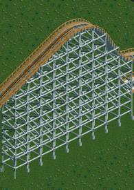
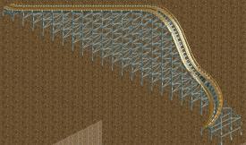
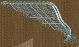
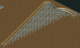
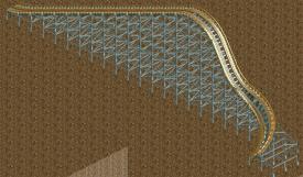
No matter how well custom supports are made, the default wooden supports always look better imo.
 -

 RRP
Offline
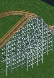
i like how you can create different weights though. The different center supports make the supports look thinner at the bottom than the top. These are a try at hybrid supports but i think the wooden fence is to thick
 -

 Austin55
Offline
Cocoa-That really neat, I like all the basic shapes.
RRP-The thin fence looks the best IMO, but I think if you made the footers stand out (or rather not blend in) it would look better to. -

 Liampie
Offline
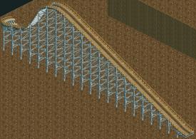
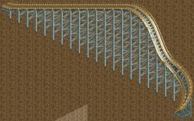
Last two screens are impressive. I never thought custom supports for a (hybrid) wooden coaster could look this good.
Now use it somewhere!
-

 Austin55
Offline
Ive already started my next big project, a ceder fair park.
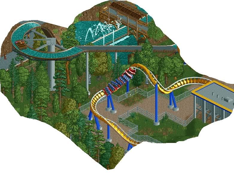
Some unfinishedness in the top. Also, is it possible to get rid of the little bit of supports on the Shoot-the-chute?Edited by Austin55, 20 February 2010 - 09:50 PM.
-

 Goliath123
Offline
To be honest Robbie the more i look at your work the more i like it. I went through Rangda earlier on and was amazed again, much more then the first time. I only wish you could actually finish something on this level! The only concern i have is maybe add a deco trim on the station roof where the lights are hanging down. And maybe could you turn the map 180 so we could see the facades? Love the tunnel it goes into btw
-

disneylhand Offline
That screen seems very geewhzz to me
(Which generally is a good thing).
-disneylhand
 Tags
Tags
- No Tags
