(Archive) Advertising District / Dump-Place
-
 19-April 07
-

 Liampie
Offline
Wow, that's one of my favourite screens from you. What park is this? It doesn't look like Six Flags or Muskoka Grove.
 -

 Louis!
Offline
Robbie your stuff lately has been really good purely because it's not overcrowded.
dlh I actually don't like that. The path textures don't work for me and neither do the trees. -

 RRP
Offline
i agree with louis dlh that area was more urban last time i looked.I dont think any of it looks urban unless youve completely changed the theme. I dislike the path,trees and castle walls the most though.
Looks good robbie,the beach showers are a nice touch. I think the woody being grey makes it look very drab though. If this is a seaside i think the woody would look better more vibrant and colourful. -

 SSSammy
Offline
yeah, im not feeling that dlh. waaayy waaaay messy.
robbie what happened to "im not going to advertise this and surprise everyone!" ? -

 Louis!
Offline
^He hasn't advertised it, advertising it would be creating a topic for it, this is just a screen
-

 robbie92
Offline
Besides, I was feeling pretty iffy on this area for some reason and wanted to see if anyone could pinpoint a reason why.
@RRP: The gray is for steel supports, like the real version of my inspiration for this. I like woodies better w/ white or brown, but this is realistically accurate, so it stays. -

inVersed Offline
Robbie, if this is the same park you have been showing for the past few months, it is easily my most anticipated park in progress -

 Cena
Offline
Robbie, it would be cool if you made the supports your own, same as I do with the Flying Turns, that would be my only concern, which I have on many people their work, they are a bit easy on the supports (woodies etc).
But none the less, that screen is pretty cool, as you pointed out, still unfinished (roof objects/art deco's )
)
Disneylhand, your screen is good, however, too much different path in it, is what I don't like, and the high trees before the fountain, the fountain should be the centerpiece, now you are kinda blocking that idea, with the trees. I think this is still your existing PT3 entry? Which you are finishing? Because Goliath123 is still saying it is version 2, but the other screen (the invert) is exactly that area from the PT3 entry, so I am a bit confused here. -

 Six Frags
Offline
Hey robbie, how big are your parks?
Screen looks nice.. Maybe the sides of the entries to the buildings are a bit too thin; I think if you place those deco poles on the inside of the entrance it would look better..
dlh; Nice to see new work of you! It looks very nice, although it's more of a teaser than a screen, and I hope you could finish it.. Is it from a park or design?
SF -

 Ripsaw
Offline
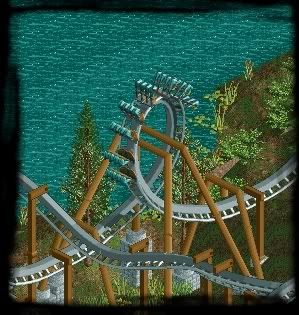
Lovin that Invert! Disneylhand!!
Ok heres a little invert screen i was playin with while thinking of new things for ThorpePoint.
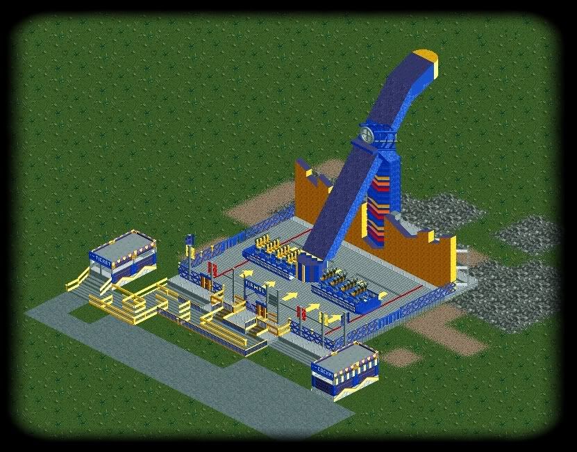
And my next Custom ride...
Presenting Mondial's Inferno
based on the Airwolf one
Yes i know the arm size is huge...but if you look on the real one you will realise just how big it is in real life.
Dan Thorpe
aka
Ripsaw -

 bluefire09
Offline
Ripsaw, that's awesome! I know how Airwolf looks in real life and your version is nearly perfect.
Please add an exit and some more lights. -

 J K
Offline
Yeah I'm loving each one you produce. It takes skill as well so I appreciate it even more.
 Tags
Tags
- No Tags


