(Archive) Advertising District / Dump-Place
-
 19-April 07
-

 wheres_walto
Offline
Very nice C-Fan! I really like colored windows and i love the waterfalls surrounding the building.
-

 Splitvision
Offline
Both screens are ace, especially colorado-fan's. The geometry of the waterfall and the cliffs are a bit confusing, maybe it's just the angle? the castle thing looks brilliant, nice little details, it maybe needs just some more colour though.
I love the atmosphere in your screen, wheres_walto, I don't quite get the theme but it all gives off a pleasant feeling. I'd remove the two brown paths, maybe have a planter in place of the bottom one, and also get rid of atleast two colours on the bottom brick building, probably the black and the white.
Good work both of you! -

 JDP
Offline
Yeah both screens actually bring something to the table. Well done both of you, keep doing your thing(s).
-JDP -
![][ntamin22%s's Photo](https://www.nedesigns.com/uploads/profile/photo-thumb-221.png?_r=1520300638)
 ][ntamin22
Offline
I don't know what that is, colorado, but a mounted statue overlooking a waterfall? this had better be seriously epic.
walto, i love that clock. -

 JDP
Offline
^Yeah, it reminded me of a stage that you would see in Tomb Raider... or something else epic along those lines.
-JDP -

 sixflagsfreak56
Offline
I would take the weeds off the top of that building on the left, and also on the hotel structure, put an actual wall between the porches.
 -

 Cocoa
Offline
I dislike all the dull brown, colorodo, but the structure is really cool. maybe just get more textures in there.
 -

FullMetal Offline
Colorado-Fan, that looks very familiar (and awesome!). Did you take any inspiration from anywhere? -

 That Guy
Offline
I just don't see what's so great about Colorado's screen... Maybe its just the cropping that bothers me...
But Walto, I really dig the atmosphere on your screen. -

 Comet
Offline
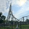
That looks real good panther
A BGE recreation is a very ambitious thing for you to take on, but in the end I think it will improve your parkmaking
A few things though, normally trains aren't fenced in that tightly like you have it, and I'd try a different foliage combination with more dark greens -

 panther33
Offline
A few things though, normally trains aren't fenced in that tightly like you have it, and I'd try a different foliage combination with more dark greens
The train in real life has a bridge right there. And the fences are right next to the train. And what do you mean by different foliage combination? What part of the screen?
 Tags
Tags
- No Tags


