(Archive) Advertising District / Dump-Place
-
 19-April 07
-

 Kumba
Offline
10,000th Post!

A rare overview (yet unfinished) from me and a bonus pic where you can actually see whats there. Great to see this idea Gwazi had snowball into what is likely the biggest RCT topic ever
-

 In:Cities
Offline
its so hard to tell just how massive that project is just by the overview.
its so insane lol.
love that endless wave though darren:] -

 Liampie
Offline
@zburns: I like that except for the queue's texture (same as roof) and the lack of some colour.
@Kumba: Looks pretty big. I can't tell from the overview, how much work is done already in per cents?
Love the second screen.Edited by Liampie, 10 February 2010 - 03:05 AM.
-

 RamSam12
Offline
Nice work you have going there Zack. Obviously some problems like the stairs into the airgates can't be avoided due to the level at which the entrance huts sit on in the game. That tight turn at the end really doesn't bother me since it is a throwback to a time when Arrow bent track in all sorts of crazy ways for new thrills. The only thing that doesn't go well with me are the supports. The only time Arrow ever used tubular supports like that for supporting a lift was when they were built a coaster that was originally supposed to be a B&M (Drachen Fire). But it all comes down to your choice in the end. Keep it up man.
Kumba, looks great, but the waterslide track dropout seems a bit close to the edge of the splashdown pool. I'm really interested to see how you did that functional flowrider too! -

 Splitvision
Offline
^ Agree with Ramsam on the slides being too long Kumba, shorten them with one piece and it'll look better. Right now it's just brilliant, at best
-

 Kumba
Offline
I would agree with you guys, but last time I went to a water park I noticed the slides were really long and when you went down you would keep going down the long shoot till you stopped on your back. Then you kinda had to get up and walk out of it. I know some drop you right into the water, but im mostly going with what I saw at the water park (Wet-N-Wild, Orlando) I went to.
Liampie, id say like... 95% or more. I hope to finish it this month, but I have been saying that since December and keep adding stuff or procrastinating.
Thanks for the comments. -

 BelgianGuy
Offline
Snake Snake Cobra Cobrabara
VECTOR ARROW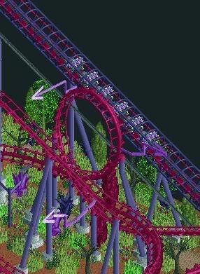
Note: this place is warped by the presence of a powerfull witch hence the strange colours... -

 jon
Offline
I understand you have a theme going but that green hurts my eyes and the purple bushes don't work imo.
zburns, thats one of the most refreshing screens ive seen recently. takes me back like 5 years lol -

 JDP
Offline
Oh, if only that small turn at the bottom didn't exist...Just to prove that I'm still building, I guess. This one's an arrow looper design, probably 50%-60% complete. I wasn't going to post any pics at all, but I always feel like getting comments here is what inspires me to keep projects moving.

-JDP -
![][ntamin22%s's Photo](https://www.nedesigns.com/uploads/profile/photo-thumb-221.png?_r=1520300638)
 ][ntamin22
Offline
very classic stuff zburns, quite fitting for an arrow.
belgian guy, I want to like it but honestly its hard to look at. If you were going for that good job, but I kinda doubt that was the plan
Kumba- it really is hard to get a grasp of how big that is, both the park and the building. how many floors tall is the main tower? I see the dive machine and those kickass watershow bleachers, but I'm still finding it hard to picture how big the place really is. -

 panther33
Offline
Here is another one guys! I know that its a bit unfinished in the corners and it needs catwalks.
Join me and ride the 32 year old beast!
Thanks
~Chris~ -
 Jaguar
Offline
Snake Snake Cobra Cobrabara
VECTOR ARROW
Note: this place is warped by the presence of a powerfull witch hence the strange colours...
For some reason, I like strange colors, and I really love the look of this coasterHere is another one guys! I know that its a bit unfinished in the corners and it needs catwalks.

Join me and ride the 32 year old beast!
Thanks
~Chris~
That is a pretty good lochness monster from what I can see, are you making a busch gardens rec? -

 zburns999
Offline
Thanks for the comments on the screen guys.
Comet: Thanks man. I played around with the station a lot until I got a design I liked; the originals were all waaaay too complex looking. I thought this one captured the old school vibe I was going for. With the airgate, I don't think I can do anything about it unless I moved the entrance a square away from the station--which I don't know how to do. And I think that last turn will make more sense in-game. This really isn't a traditional Arrow Looper.
Kumba: Thanks man. Appreciate it.
Sam: The supports were my biggest point of debate with this whole design. In the end, I think they make sense this way--although I may change em up a bit.
projekt: Thanks a lot man. Glad you like it.
JDP: I knew there would be some questioning about the layout in this screen. Just wait till you see it in-game. This is not a traditional Arrow looper. I think all the elements really flow, and would be sick in real life.
][22: Thanks man. I'm glad you see the Arrow in it already, as I was afraid many people would find it too non-traditional.
As for the rest of the screens on the page...
coasterfreak, I think you've got the right idea. I just hate how paths look in that style--almost too clean and precise. The buildings kind of fit into the same category. Just a bit too blocky. Also, delete one rope fence so it doesn't look so blurry. Otherwise, it's really nice.
Kumba, it's awesome. I don't think there's much else to say. Can't wait to see it.
BG, I love it except for that foliage. I know the colors are supposed to be weird, but the actual choices for trees and grass are a little questionable. More dead trees would look awesome, I think.
Panther, it looks great man. As you said, it still needs some work, but that queue is ridiculously nice looking.
 Tags
Tags
- No Tags

