(Archive) Advertising District / Dump-Place
-
 19-April 07
-

 Turtle
Offline
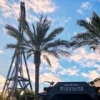
Nemesis Inferno is high off the ground.
However it doesn't seem very Tussaud's like, especially if that is the entrance. But I really like the screen. The coaster colours are really nice too.
Fair enough, but I don't see why anyone could possibly want to emulate Nemesis Inferno in RCT when Nemesis is that much better... -

 turbin3
Offline
Well, we all know you take care to copy things.
---
Nice screen, JDP, I like the coaster colours.
-

 Louis!
Offline
Fair enough, but I don't see why anyone could possibly want to emulate Nemesis Inferno in RCT when Nemesis is that much better...
I hate Nemesis. I think it is a rough pile of crap. Inferno however I love I think it may be a South thing
-

 JDP
Offline
Thanks for all the useful comments everyone. It's by far more Nemesis Inferno rather then Nemesis. However it isn't a recreation, and has a different element then NI. I didn't want to do a Nemesis design because I didn't want something with too many inversions; four is good enough for this coaster.
As for me never being to a Tussauds park, I'm trying to do what I can with what I know (which isn't much). If either of you (Louis or Turtle) can shoot me a PM on what can improve the entrance to look more Tussaud's like, I would appreciate it.
And thanks for the comments Sammy, Turbin and Comet! Comet, you'll be able to see more of everything as a whole later on, or when the park is actually released
Also thanks Louis for clarifying a few comments made. Less I have to respond to
-JDP -

 Turtle
Offline
I hate Nemesis. I think it is a rough pile of crap. Inferno however I love
 I think it may be a South thing
Blasphemy! Nemesis is amazing! I'm from Bournemouth, doesn't get much more South than that!
JDP, if you have any specific questions, feel free to PM them and i'll do what I can, i've been to Thorpe Park about ten times and Alton Towers maybe five? By no means an expert, but happy to help! -

 Louis!
Offline
Brighton > Bournemouth lol
 but yes you are more southerly haha!
JDP i'll PM you tomorrow, I spend my life at Thorpe Park lol i've only been to Alton a couple of times but I still know it enough.
I think here though it's the fact that it isn't very open and the brighter colours.
If you're looking for a more generic Tussaud's entrance then look at Thorpe's, but i'll PM you, with some photos too
-

 JDP
Offline
Thanks for being awesome guys, that's mad clutch of you both! Turtle I'll shoot you a PM if I have any other questions about things that I don't get from Louis. And Louis, JK told me before that I should use dark colors (which I was doing well till the white came into the picture). That entrance might be the brightest thing in the park however...
-JDP -

 JDP
Offline
Hehe, no problemJDP, I hate you for making me want to put down LL and start playing RCT2 again!

-JDP -

 Comet
Offline
Not sure I've ever seen a more realistic station/queue structure than what you have there
The walkway around the edge of the building with the roof over it works beautifully, and there's just enough details and textures
I don't like how the stair leads right up into one of the airgates, and the final ascent into the brakes looks a little tight
Overall very nice though
 Tags
Tags
- No Tags


