(Archive) Advertising District / Dump-Place
-
 19-April 07
-

 Midnight Aurora
Offline
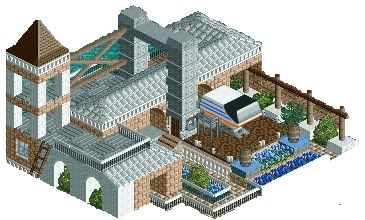
It's just a test for something else, but I thought I'd show off what I have done to see if someone else can do something with it. So, no real theme, yet. The barrels and fences were added as an after thought, for shits and giggles. Codex is a real god-send.
@Metropole: Because LL is a dying breed simply because people don't know how to push the limits of it. So, I push the limits of it. Also, I hate building in RCT2.
@Intamin: You can do what Loopy said, or you can click on the plus sign next to the path in Codex and change the 7th bit to "FF". Hell of a lot quicker and neater. -

 egg_head
Offline
Why? I could do that in RCT2 too. Stack mazes and stuff. so that's not so obviousli its ll.yeah guys it's really fucking obvious it's ll.
I could build the exact same thing in RCT2 too out of mazes and rapids so don't say it's clearly ll because there are rides stacked up. damn. -

 tracidEdge
Offline
because i play ll and can recognize it instantly when i see it. also it's midnight aurora, who doesn't play rct2.
 -

 posix
Offline
well, it looks alright, i guess.
but somewhat weird. in no way worth the effort it takes.
also, it should be rather sensitive. too risky to build like that when one click gone wrong can ruin 30mins of work. -

 tracidEdge
Offline
that's why you save often when working on something like that.also, it should be rather sensitive. too risky to build like that when one click gone wrong can ruin 30mins of work.
-

 gir
Offline
EDIT: Sorry about the blank grass under the curve, just try to ignore it.
Huh? I think it should be left that way. There's no rule that says every tile must be filled. -

 Gwazi
Offline
^ That's what I was thinking, but oh well. Looks nice.
@zodiac - Leave that grass there, but change some of the land type. That would look better imo. Also, that building is really blocky. -

 Levis
Offline
magnus' black tiles are colorable.
first select the black color before you place them, else it looks wrong .
.
-
 Jman
Offline
^Absolutely stunning. You've improved so much.
Something I've been working on lately, about 90% done. -

 Midnight Aurora
Offline
Ugh, uninspired, RMM. Wow me, dammit. It just looks like you randomly placed shit.
 -
 Loopy
Offline
Me too. RCT's not always about stacking as much stuff together as you can. I'd rather have atmosphere than detail everytime.
Nice work RMM. -

 Fr3ak
Offline
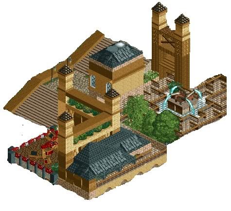
First, I want to say Hi.
Cause I'm new registerd on this forum. I'm not completely new, cause i've read the posts here for a long time ago.
And today i've decided to register and show you something of my work.
I don't want to start a new topic for this picture, cause it's just some fooling around and I don't know, whether i'll ever finish this.
So, here it is, my pic.
*click*
It shows an little spanish arena.
The area round the arena isn't finish yet, so I want you to only comment on the arena, please.
f3kEdited by Fr3ak, 12 June 2007 - 02:53 PM.
-

 RCFanB&M
Offline
Looks nice, I like how you used the wooden tracks for making the stands. The structure is interesting, so I'd like to see more from your work. Hope you advertise a park someday
 Tags
Tags
- No Tags

