(Archive) Advertising District / Dump-Place
-
 19-April 07
-

 robbie92
Offline
robbie, as much as i like your realism, and i might have said this before, but I really think you could put your skills to use better in an all-out themed park, compared to just six flags boringness.
Part of the challenge is the "boringness" you speak of. With a theme, you can disguise your faults or be outlandish in ways. When you do a Six Flags park, you must show restraint, and the forms of your structures shine. In fact, I find six flags parks harder than themes in that I do have to hold back, and I need to create a certain atmosphere that's difficult for me, that of a normal park. -

RMM Offline
eh, not seeing what everybody else is.
terrible tree selection. pandora is lush, full of deep, strong cool colors.
and i think you could experiment and pick a better track type for the dragon thing.
... the ONLY reason it even slightly resembles avatar is because of the dragon. it can be done much better.Edited by RMM, 07 February 2010 - 05:24 PM.
-

 Austin55
Offline
ya sorry Im not feeling it either. its a good idea but the hedge fences dont look to good, and the waterfall falling straight down? Kinda boring. The animal thing looks really nice, IMO.
Robbie-I completly get what your saying. The themed areas in the Six Flags park Ive been working on are so much better than the generic areas.
something I have been working on,
Edited by Austin55, 07 February 2010 - 05:22 PM.
-

 Cena
Offline
Part of the challenge is the "boringness" you speak of. With a theme, you can disguise your faults or be outlandish in ways. When you do a Six Flags park, you must show restraint, and the forms of your structures shine. In fact, I find six flags parks harder than themes in that I do have to hold back, and I need to create a certain atmosphere that's difficult for me, that of a normal park.
Robbie, don't worry about what Cocoa said, you still have my Disney park where you can theme. Anyways I agree with what you said Cocao, and I agree too with Robbie, that is why I am building a Disney park, I do can theme, however, I still have a major task to let it look like Disney. (for the guys who don't understand, Robbie has DFS for a guestspot atm). -

 Midnight Aurora
Offline
I don't see anything all that special about Turbine's work. Sorry, dude. I haven't seen avatar, but it seems extremely squared off, the colours clash, and the textures clash even worse.
 -

 Goliath123
Offline
To be honest its not even close too avatar, like the movie to create something in rct2 it would take like 5 years, my avatar park is like 1% after 1 month, ive only done 2 hallelujah mountains anyway, to me it looks way off, why is a banshee next to a building as well?
The colours are red and yellow btw. -

 Evil WME
Offline
Just saw Avatar last night.. don't really like the screen though. srry.
Would be cool to study up a bit (don't know if that is possible) and create that entire world in rct! >_< -

 Comet
Offline
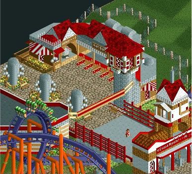
Looks nice JDP
Just needs some more details on the roof on the left and I don't like that fence that you used for the ticket queue
Not sold on the coaster colors either but that could change if I saw more of the area -

 turbin3
Offline
Haha, so many mixed opinions about my screen
@wheres_walto: Thank you.
@prodigy: Thanks!
@Louis: Thank you aswell. Well, I'll try to remove it but imo it fits, haha.
@Cena: Dont know how to interpretate that post, positive or negative.
@Turtle: Thanks.
@In:Cities: I love you, too
@Nokia: I guess its positive? Thanks.
@RMM: I like the track I used and moreover I like the colours/trees. So I am not gonna change it. Thanks anyway.
@Austin55: I'll try to make it a bit more 3D.
@SixFrags: Thank you, also I dont think so.
@Midnight_Aurora: Your opinion.
@Goliath123: Honestly, where do you know the colours are red/yellow? You dont even know which dragon I build, maybe it's my own interpretation? Thanks.
@EvilWME: Same as M_A.
Didn't expected so much (positive) comments. Thank you all
-

 Turtle
Offline
JDP is that Tussauds? If so, the invert looks too far off the ground... And not themed enough.
 -

 Louis!
Offline
Nemesis Inferno is high off the ground.
However it doesn't seem very Tussaud's like, especially if that is the entrance. But I really like the screen. The coaster colours are really nice too.
 Tags
Tags
- No Tags


