(Archive) Advertising District / Dump-Place
-
 19-April 07
-

 nin
Offline
The path doesnt go too well with it, needs more of a "sci-fi-ish" path rather than rock.
 -

 T.N.T.
Offline
Erm... anything else? All I see is a cluttered mini golf with a Wild Western-dinosaur theme.
 -

 Comet
Offline
Stations ugly and so are the entrance/exit to the ferris wheel but otherwise nice
I also think a full tile tree with a fence around it rather than being in a planter would work better/add shade -

 RRP
Offline
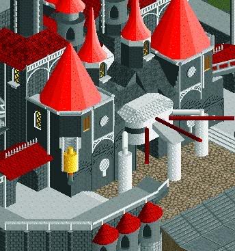
Why the other "path" thats a roofing object?
I agree there, sammy and louis seem to be the worst offenders for doing that aswell. I understand your trying the make the pathing more dynamic but if your going to do it try and overlap some of the actual grey path to create a pattern or help smooth the shape.At the minute its a bit random -

 JDP
Offline
^Not to mention when the peeps walk on it, it glitches. I know that's not too big of a deal but it gets really annoying when watching in game.
And sammy, that entire screen just seems rushed and unfinished.
-JDP -

 Timothy Cross
Offline
I'm really looking forward to your park SSSSSSSSSSSammy. Hope you finish and get an accolade.
 Tags
Tags
- No Tags


