(Archive) Advertising District / Dump-Place
-
 19-April 07
-

 posix
Offline
belgianguy i just really like this. and i liked your original headchopper better, even if it is indeed a little forced.
 -

 RRP
Offline
i think it would be better without the head chopper you should also try and have maintainance access to the pits
 -

 Cena
Offline
Kumba, that looks pretty awesome
 One minor tip, add diagonals to the supports, I think there is getting too much weight on the straight part of the supports now. with diagnoals you can counter that force mostly.
-

 Splitvision
Offline
Belgian Guy, as Posix has pointed out a few times, you have a great talent for colors. I love the latest screens you've shown, but I have to agree with the majority on refining the headchopper. Everything else apart from that is fantastic.
Great execution of that Kumba! Or, I think atleast... it is a frog right?
-

 Liampie
Offline
Wow, another project by Kumba? Great.
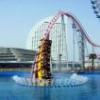
I really love that screen; the colours are weird but they work. Interesting details, lovely frog (why the moustache? ), peeps, traditional Kumba-atmosphere. The only things I don't like are the supports as Cena pointed out and the map edge. Is this a park or a design?
-
 LDW
Offline
Kumba, I love the screen but the right leg looks as if it is floating above the peeps. I don't know if it supposed to do that but it looks out of place.
Edited by LDW, 26 January 2010 - 03:27 PM.
-

 Steve
Offline
I'd point the toes on the left leg towards the other direction to open the path a bit more at the entrance. Apart from that, looks pretty good to me.
 -

 J K
Offline
Darren I really like it. This is something I'd imagine you and I doing if we were going ahead with a park. Other than that the colours are good but maybe change the whole back to purple and give it some green spikes running down it's back?
 -

 Cornshot
Offline
I think I remember seeing that somewhere but I can't remember where. It was a water coaster that went down a waterfall right?
 -

 Cornshot
Offline
I think I remember seeing that somewhere but I can't remember where. It was a water coaster that went down a waterfall right?
Edit: Sorry, for some reason it created a double post. Is there anyway to delete this?Edited by Cornshot, 27 January 2010 - 05:02 PM.
 Tags
Tags
- No Tags

