(Archive) Advertising District / Dump-Place
-
 19-April 07
-

 Louis!
Offline
Cocoa, I really like it. The only thing I see wrong is the raised rock land. It could do with being a little bit lower.
 -

 Sey
Offline
Honestly, it isn't quite specific so far to what Nepal looks like...
Even though it looks really good! -

 J K
Offline
Cocoa I like it all except for the weird hut texture over the seating. Only because the texture confuses a strong set of decent textures already so to throw that one in there seems to unbalance the look your going for.
 -

 turbin3
Offline
Pretty good, I love the coaster colours.
Just the landscaping on the top middle is looking odd.
-

 Louis!
Offline
I like it. I think the foliage is well done as is the building. The landscaping in the top corner isn't natural though and looks very forced.
 -

 Hepta
Offline
Ehhh not of a fan of that landscaping over that little helix. Looks so unnatural and unlikely
 -

 Comet
Offline
Yeah Louis, I'll admit it definitely was forced, I'm gonna try to make it look more natural but definitely gonna keep that feature
And LDW, the hedges go along with the house, they won't be out in the middle of the forest -

 Six Frags
Offline
You still haven't got your foliage design down imho comet; The trees are too close to each other and there are too many in that 'tree area'.. Just spread them out more and it will look a ton better I think.. Those hedges also mess up the flow in your landscaping.. I think only deletion would help (I usually only place them around trees on all sides on flat land, but that's personal taste I guess)..
The building looks alright, bit basic but it does its job. I like the diagonal glass in there..
SF -

 BelgianGuy
Offline
Looks nice comet, really cool colours on the coaster only the building needs some love and a paint brush^^ maybe try adding a splash of deep orange and/or gold with some deco-pieces...
Other things are fact I changed the colours back to the original, of the Diver,
so here's another one for you guys to see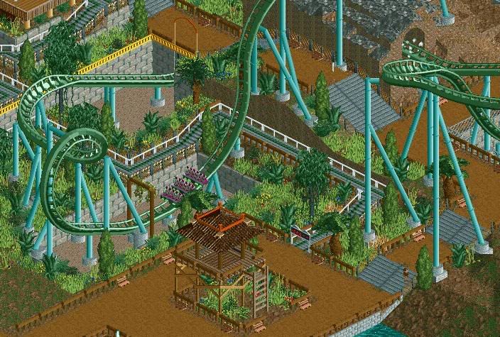
Hint: watch out for your head!!! -

 ahank
Offline
Wow, I really like most of that. The head-chopper thing looks a little randomly placed though.
 -

 Louis!
Offline
Yeh the headchopper is bit, "oh i'm gonna place something here to use as a headchopper". It's just a bit random.
Also I can't help but think that the transition to vertical on the drop isn't tight enough.
But the surroundings and colour is just brilliant. -

 BelgianGuy
Offline
How would you advice to adjust the headchopper so it'd look better? cuz I really want to keep it there
 -

 Louis!
Offline
Make it more of the same theming that surrounds the area, for example the lookout tower. Or attatch it to a building so it looks like it has a purpose.
 -

 K0NG
Offline
Exactly. As has been said, right now it's just too random. The only complaint I have with the screen is the gray steps amidst all the dirt path. I'd make them either look wood-ish or just use step objects and color them to resemble adobe or something.......so it looks like it has a purpose.
-

 J K
Offline
Also just change the colour of that yellow border, one to blend in with the jungle vibe would be best.
 -

 BelgianGuy
Offline
Is this any better for a headchopper?
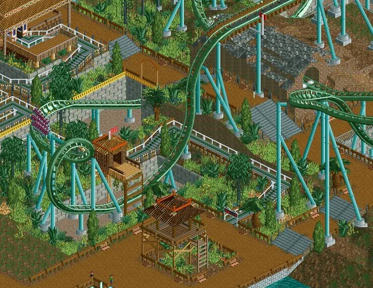
@J K: The yellow border is really necessary to keep the balance of the colours in the overall look, itswuld look too camo if I'd change it but I'll see what I can do... -

 Louis!
Offline
It is better as it now has purpose, however it could be better executed. And it is quite high for a head-chopper.
Also I think the yellow would look better as a brown.
 Tags
Tags
- No Tags

