(Archive) Advertising District / Dump-Place
-
 19-April 07
-

 DelLagos
Offline
Yes, at the moment I´m building a Wooden-Coaster!
Here is a little Teaser:
I hope you like it...
-

 Comet
Offline
^It looks to me like Millennium Flyers would go better with that layout, but maybe I would need to see more to tell. I really like the supports and how you have it on a cement lot though.
-

 FK+Coastermind
Offline
Zodiac-like the form and the detail is good. it the color that ruins it for me. so much brown with not even an accent of another color. brown is a nice safe base color but try to spruce up your buildings with some other color here and there especially for making detail stand out.
Pineapple- the coaster looks nice but nothing else there really. i kinda dont like the idea of a frowzen waterfall mostly becuase it would be so hard to pull off. i dont really like the look of it.
DelLagos-i love the look of that hill! it looks very nice and smooth. my one problem with that screen is all the gray at the bottom. while i think that some of the area under the coaster would be cement it would be only where needed and not so much. the foliage is okay but a little random in choice of bush. nice work.
Comet-its a nice layout. not extremly original but not boring. its very short for my liking. maybe some more lenght to the ride would be nice.
FKEdited by FK+Coastermind, 22 September 2007 - 04:14 PM.
-
![][ntamin22%s's Photo](https://www.nedesigns.com/uploads/profile/photo-thumb-221.png?_r=1520300638)
 ][ntamin22
Offline
zodiac- too much brown/tan. it needs something to outline the pieces, i.e. an accent color, even if that's black. I like very much the design of the building, but it took me a while to decide that since all i see is a blob of tan. =/
pineapple- i'm not so sure about this. you're going to have to do a little more to convince me that the waterfall is frozen, since that's sometimes how not-frozen waterfalls are represented in LL anyway. Waterfalls are very unlikely to be frozen anyway, since all the water is moving there. If the waterfall were flash-frozen i'd expect to see ice forming on your buildings, too.
Comet- not sure what to say here. it's not a terribly exciting layout, though it is fairly well done. It needs more interaction, such as over path or a tunnel section or something.
dellagos- looks good. Concrete is an intriguing idea, but i'm not sure the whole coaster will look good like that. foliage seems reminiscent of texas somehow.Edited by ][ntamin22, 22 September 2007 - 04:16 PM.
-

 Cocoa
Offline
dump
Not sure about the whole landscape thing. I could scrap it and just make it a regular building. -
![][ntamin22%s's Photo](https://www.nedesigns.com/uploads/profile/photo-thumb-221.png?_r=1520300638)
 ][ntamin22
Offline
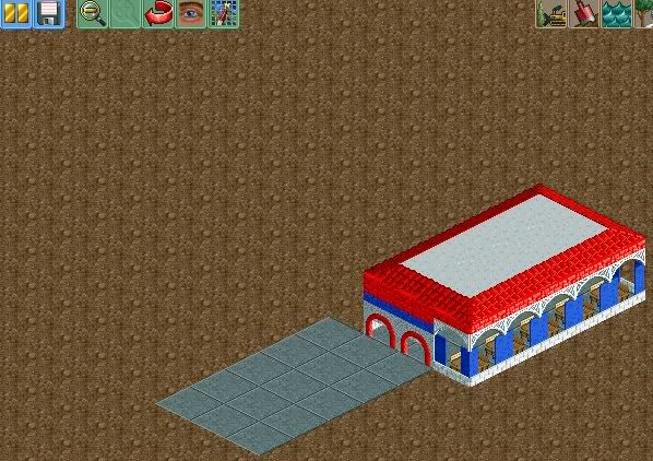
the building itself looks pretty nice, but there's a little too many fiddly bits on the second story. As for the landscape, I don't have a problem with it aside form the fact that it'd be a bad idea to build there with so much rushing water... where does the inside of the building go? is it just a tunnel through the cliff? one other thing- see if you can rotate the trees. all but one of your oaks [i tihnk they are oaks] has that same hole at the top right, kind of ruining the natural feel.
 -

 Dr_Dude
Offline
My first building, ever. Need constructive critisism!
Edited by Dr_Dude, 22 September 2007 - 06:00 PM.
-
![][ntamin22%s's Photo](https://www.nedesigns.com/uploads/profile/photo-thumb-221.png?_r=1520300638)
 ][ntamin22
Offline
teaser for my micro.
my goal with the project is to bring to light the enormous potential the game has by exhibiting lots of little things.
In this screen it's the rapids and lowered S-bend.. the glitched rapids are intentional, just facing the wrong direction.Edited by ][ntamin22, 22 September 2007 - 08:06 PM.
-

 DelLagos
Offline
Okay, here is another teaser of my woodie!
I worked a little bit at the footers and the plants:
I hope you like it!
-

 posix
Offline
the foliage is interesting. not sure on the poles, but still looks like a nice woodie.
 -

 sfgadv02
Offline
Wow ][ntamin, I loved the waterfall that was done in LL, but what is that red line?
 -
![][ntamin22%s's Photo](https://www.nedesigns.com/uploads/profile/photo-thumb-221.png?_r=1520300638)
 ][ntamin22
Offline
that's a lot of path. the fountain looks great, but it seems like there should be a statue or flag or something on top of it. I'd also say you could tone down the brightness a tiny bit, too, but that's probably just me.
 -

 SenZ
Offline
Well, couldn't stand the urge of playing RCT after a one-year break. This is what I've done so far:
None Follows The Sunrise:
Inspired on the album by Void Settler, I'm creating a 75x75 park called 'None Follows The Sunrise'. Everything is kinda fantasy-orientated. I use the album cover as inspiration:
(more detailed pictures of the booklet: here)
A warehouse in the harbor (unfinished):
The castle (unfinished):
I also finished a design I started months ago. Here a tiny pic of the main square:
enjoy..
 Tags
Tags
- No Tags


