(Archive) Advertising District / Dump-Place
-
 19-April 07
-
 ahank
Offline
Your building?
Not sure how I feel about the monorail touching the coaster track in the third screen. Also, maybe just a personal thing, but I think there may be too much tall grass in the top right of the second screen. Other than that, it looks really nice. -

 nin
Offline
Yeah if the monorail was one unit higher it'd be great, but imo a suspended monorail would be much better.
 -

 Midnight Aurora
Offline
Fucking awesome, eyeamthu. Good to see someone break out of absolute realism.
 -

 Midnight Aurora
Offline
Any topic JDP has ever commented on about train length.^^What would you consider to be absolute realism?
-disneylhand -

 K0NG
Offline
^So, pretty much everything that has a coaster.
eyeamthu1.....All three screens are nice but, the second one is just the shit, man. -

 Liampie
Offline
I've been waiting for these screens for over a year. They didn't disappoint me; they blew me away.
 -

 JDP
Offline
The drop in that first screen looks amazing. Just how perfectly it rips through the landscape is great.
...and it's finally nice to see someone that's good at turning transitions.
-JDP -

 BelgianGuy
Offline
eyeamthu1 thats just sick cool looking, the wooden track bridge is one of the best ideas I've seen in a long time....
I changed the colours of the track and worked a little on some stuff near the lift hill, Sorry for the glitchyness of the catwalks but I can't seem to solve this...
Comments are always welcome and I hope you guys like it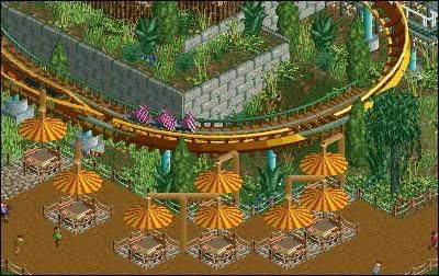
-

 SSSammy
Offline
map object manipulation, lower track one unit.
do you realise that youve fenced off the tables?
looking good stijn. -

 SSSammy
Offline
theres this little trick to make those brick fences look a whole lot better. if you raise the land a suitiable amount, build the fence on the slanted land, andzero clearance and lower the land, you get a slanted fence. that could make that part of the screen look a whole lot more versitile.
 -

 RRP
Offline
The old colours are bettereyeamthu1 thats just sick cool looking, the wooden track bridge is one of the best ideas I've seen in a long time....
I changed the colours of the track and worked a little on some stuff near the lift hill, Sorry for the glitchyness of the catwalks but I can't seem to solve this...
Comments are always welcome and I hope you guys like it
eyeamthu1: looks great,id like to see the wooden bridge a bit more substantial though
 Tags
Tags
- No Tags


![][ntamin22%s's Photo](https://www.nedesigns.com/uploads/profile/photo-thumb-221.png?_r=1520300638)
