(Archive) Advertising District / Dump-Place
-
 19-April 07
-

 Cena
Offline
I think it looks too perfect for what you are going for, it seems like you want to go for an jungle theme, which means, lots of foliage from high to low, and which is overgrown a lot, here it looks to perfect with the bricks etc. Mabye try to hide it a bit
 ?
?
One other thing, I think the trackcolor clashes with the foliage, maybe make it bright green or yellow.
Goodluck Belgiumguy, (are you from the Dutch, French or German part?) -

 BelgianGuy
Offline
Ik ben van de West-Vlaamse kust^^
I didn't want to go for a jungle theme, more like tropical paradise wich isn't as dense as a jungle. But I really like the colours how they are, maybe I'll need to counter them a bit with brighter foliage -

 J K
Offline
Nice Belgian guy! As I've said in the HM part your one to watch for me now. Your also doing the right thing by building on smaller maps to improve your skills. It's working in my opinion. It's also the sign of a clever park maker and a productive one.
 -

 Liampie
Offline
Ik ben van de West-Vlaamse kust^^
Eindelijk het mysterie ontrafeld! Ik vroeg het me ook al een tijdje af. Zit je ook op andere Nederlandstalige pretpark- of RCT-gerelateerde sites?
-

 BelgianGuy
Offline
Neen enkel op TPR
J K thanks for calling me one to watch, I do have the tendency to build a lot and I'm quite productive lately, and yeah it helps me keep motivated with smaller maps cuz I don't like to see a great ride with full on themeing and then looking at the rest of the map going OMG how will I fill up that? -

 geewhzz
Offline
I agree about BelgianGuy, he really has something special, and he's very persistent.
 -

 BelgianGuy
Offline
That I am^^ I the type of guy who won't stop till he gets it, don'tknow if thats always a good thing though...
Anyway here's some further progress on the diver^^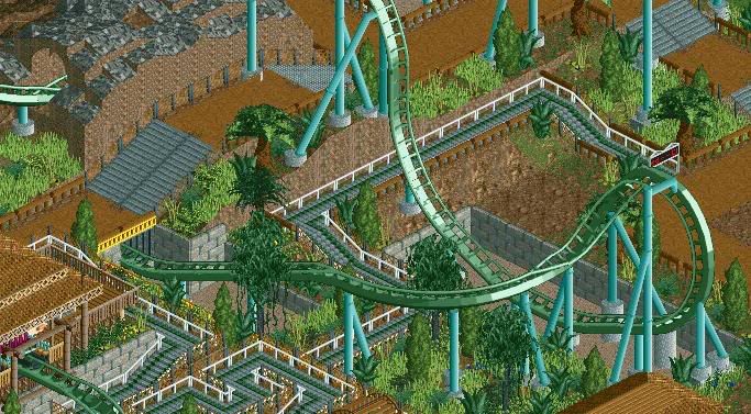
Still needs some little touches but you get the idea, I think it'll be a tropical jungle theme, its still open to suggestion though since I'm not really sure about it atm. -

 posix
Offline
i just spoke out "oh wow!" when i saw that. someone said you have a good ability with colours. i agree completely.
 -

 Louis!
Offline
Im not sure the grey stone wall works here. But I like the screen. The queue interaction is really nice.
 -

 Cena
Offline
I think the rock walls are out of place (next to the higher path and queue line), And I would suggest making the tunnel entries bigger, it is a Dive coaster, and in reallife, it is very wide.
 -

 Turtle
Offline
That looks really good man, I would play around with the colours of the coaster though, it'll look too green with foliage as well. Love the interaction of the drop over the path and the queue.
 -
 Gwazi
Offline
Belgian Guy - i think it needs a bit more warm color; that yellow would work if you used it a bit more
 -

 ahank
Offline

Probably my last screen until I finish and/or possibly submit.
*Unfinished, so it will be improved so it won't end up in next months issue of Honorary Mentions.
Edited by ahank, 22 January 2010 - 10:15 PM.
-

 JDP
Offline
It's flat, lacks inspiration, and anyone can do it. I'll probably see this in next moths issue of Honorary Mentions.
But hopefully my rude an obnoxious comments lead you to getting this thing on the front of NE, opposed to it sitting on a pile of things that didn't make it.
-JDP
 Tags
Tags
- No Tags
