(Archive) Advertising District / Dump-Place
-
 19-April 07
-

 Cocoa
Offline

BGA.
I'm hoping I can beat out jag in the number of mentions in discussion rct threads.
-

 In:Cities
Offline
awesome!
brilliant use of colors there mate:]
though, the tower on the right kindof blends into the building above it.
its like an illusion! -

 J K
Offline
Nah not to me either, Robbie doesn't really use that texture on the tower to the right. It's more RCTFAN to me.
 -

 Louis!
Offline
Yeah nothing says robbie in that screen.
Some of it looks messy, it just needs to be 'cleaned up' a bit. -

 posix
Offline
it's really colourful and nice. but i'm worried you won't know what to build next now you have this. it doesn't seem to be very planned out.
 -

 Cocoa
Offline
^^Don't worry, I've got this whole park really planned out, including where to put buildings in areas I'm working in. I've learned my lesson from not planning.
 -

 Comet
Offline
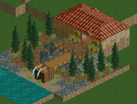
Cornshot it's pretty nice but I don't really like the roof
I recommend using the standard Spanish style roof
Also add something like deco to help transition from the brick to the roof -

 cj8
Offline
I've been playing rct2 on and off for a few years and just recently decided to get back into it. Heres some pics for ya...
This is a park I did about a year ago but never released it due to, well, a loss of interest I guess.
Dojo Gardens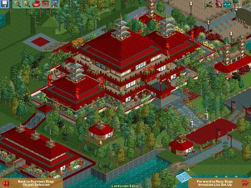
Close up of main dojo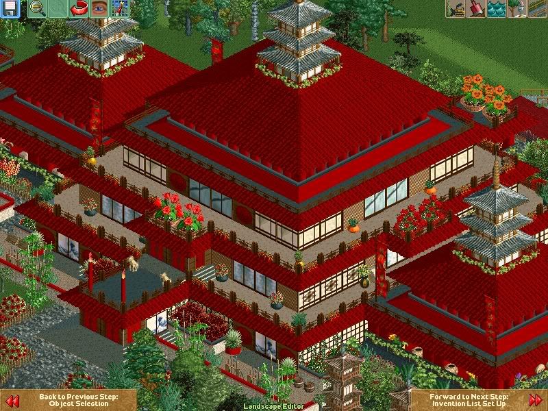
Fighting pits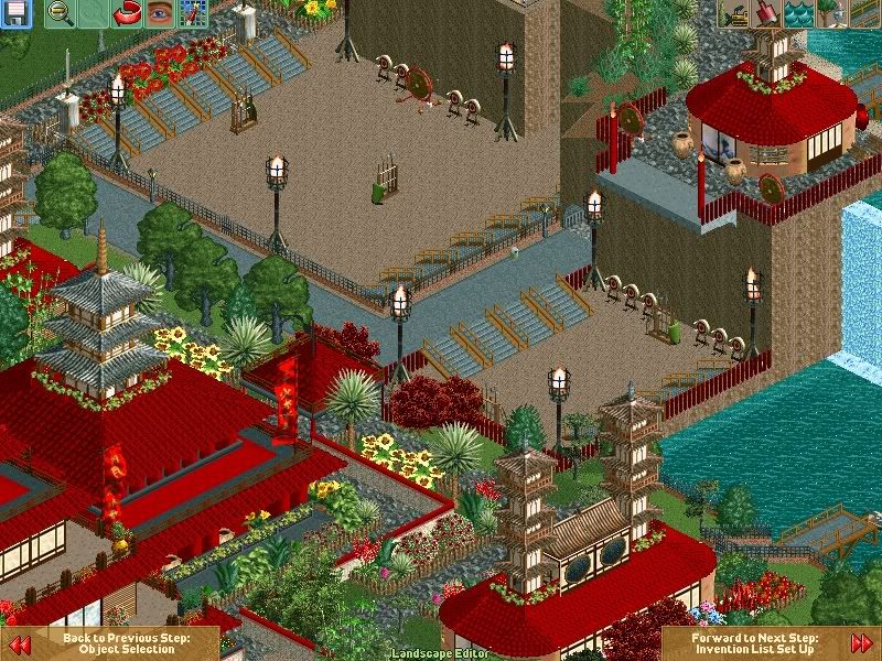
Entrance building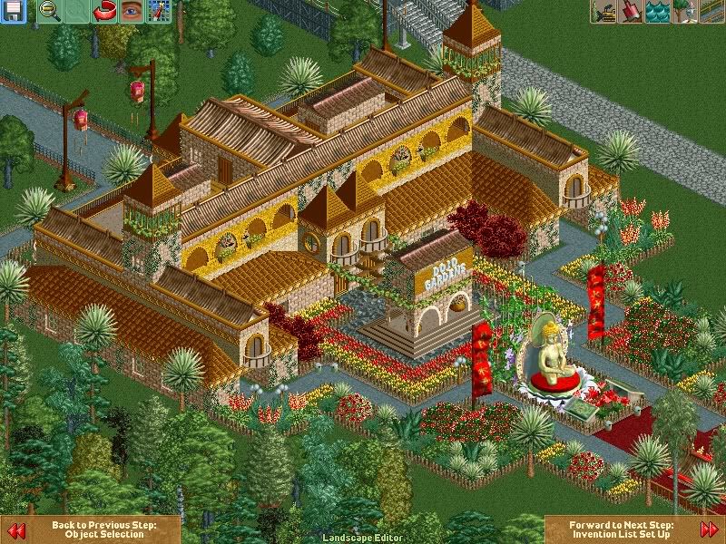
Front entrance pagoda. I don't like the colors much.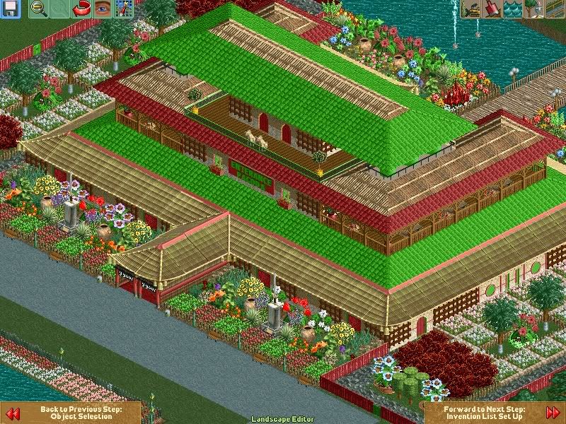
Back of entrance pagoda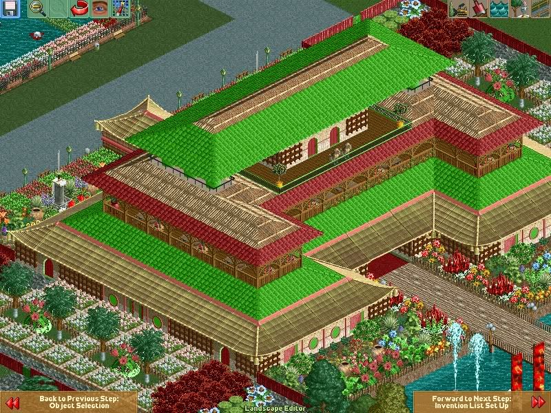
Right now I'm working on a new park and if anyone would like to help me with it just drop me a line. -

 RRP
Offline
the first 3 screens look like something i built many moons ago
http://www.nedesigns...kers&a=dl&d=178
 Tags
Tags
- No Tags
