(Archive) Advertising District / Dump-Place
-
 19-April 07
-

 Comet
Offline
RCTNW- Make the tee boxes a bit bigger, but other then that, WOW.
Chiller- Even from the little work I've seen from you, you are one of my favorite park makers. Do you have any released projects? -

 Emergo
Offline
dellagos:
Looking like a great mainstreet for a park!
Very nice atmosphere
(personally I would make a kind of larger "footer" at the bottom of the brown pillars, as well as at the salmon "columns" just to give it some extra refinement, but that is a minor detail)
Rct2 tom:
Pleasant beginning for sure!, but too little substance yet for me to comment on serieously yet.
Zodiac:
Like you said somewhere else, but in another context:
Nothing I have not yet seen before,
and no idea yet what it really is representing....
much of your work seems quite nice, but I absolutely cannot keep track anymore of what belongs to what, and....eh...are you ever finishing anything?....
Or just posting screenshots of everything you do to get flattered? (not forbidden at all and good for the ad of course, just curious...... )
)
Chiller
Please go finish that.
Seems a very nice layout.
Station still a bit blocky, but as I suppose it is meant to be a simple one, just a few irregularities or small touch ups are needed to keep the look as being simple as well as make it interesting enough.
RCTNW:
Looks nice, but cannot figure out what the paths are leading up to yet.....(apart from to flower-beds.... ) oh wait......golf again of course!!!!
Though I can imagine you will keep it like this (completely your own good style), I would fancy the grass-line on the left slightly more irregular and thereby "natural", but I'm sure the handymen in your parks will trim even them on a daily basis...(LoL!)
Emergo -

 RCTNW
Offline
Emergo, on Sep 10 2007, 02:45 PM, said:

RCTNW:
Looks nice, but cannot figure out what the paths are leading up to yet.....(apart from to flower-beds.... ) oh wait......golf again of course!!!!
Though I can imagine you will keep it like this (completely your own good style), I would fancy the grass-line on the left slightly more irregular and thereby "natural", but I'm sure the handymen in your parks will trim even them on a daily basis...(LoL!)
Indeed and I wll break the long grass up a bit. I had not gone in and added the bullrushs to the SS before I took this particular SS. In fact, I believe I already made that change. As for the "Stripes", every great golf course will have the "Stripes"
Thanks -

 Emergo
Offline
RCTNW, on Sep 11 2007, 12:04 AM, said:

Indeed and I wll break the long grass up a bit. I had not gone in and added the bullrushs to the SS before I took this particular SS. In fact, I believe I already made that change. As for the "Stripes", every great golf course will have the "Stripes"
Thanks
James, I just meant that for the rows of "long grass" indeed, .....not for the normal grass, I love that being in stripes, and even in tiny Netherlands they have them like that.....
Emergo
-
![][ntamin22%s's Photo](https://www.nedesigns.com/uploads/profile/photo-thumb-221.png?_r=1520300638)
 ][ntamin22
Offline
do more with that info kiosk, and work on the foliage some...
that field of cattails for no apparent reason, for instance. -

 Steve
Offline
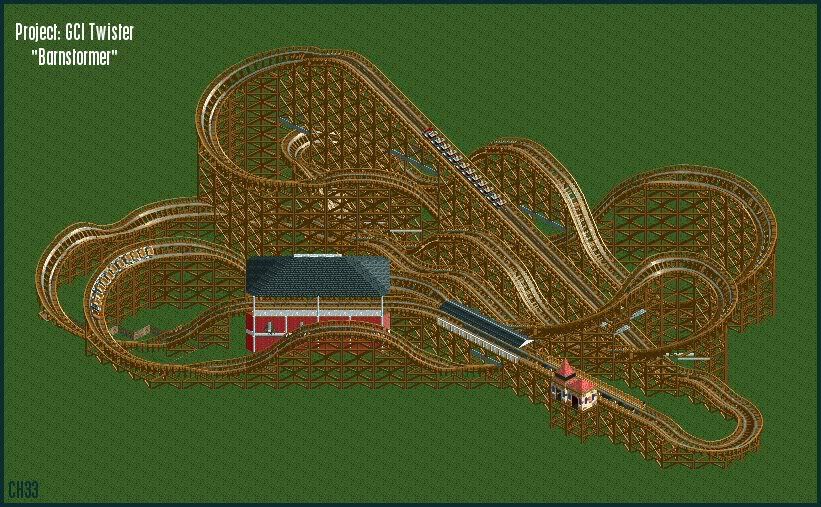
Chiller, you're really onto something there. I could see that being one of the first full projects in recent memory to fully take advantage of diagonal building. I suggest scaling down that building and bringing the brake run's roof further down the track to connect the two. The layout is awesomely curvy, too. Very nice start.
 -

 Comet
Offline
What type of train is that in the first screen?
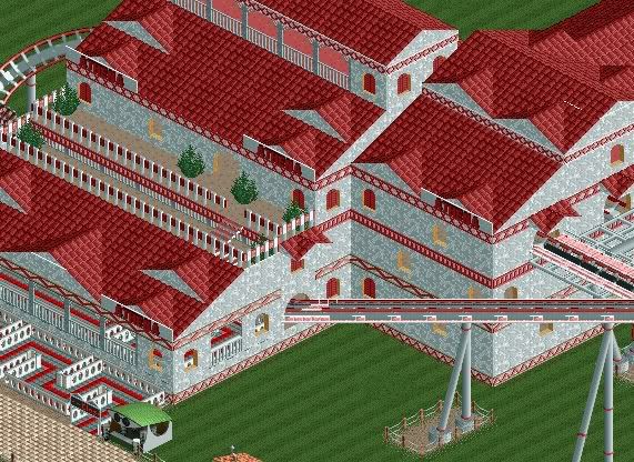
And the building in the second screen is absolutely stunning. -

 Liampie
Offline


The supports are under contruction, theming is on their way.Edited by Liampie, 25 November 2009 - 04:13 PM.
 Tags
Tags
- No Tags


