(Archive) Advertising District / Dump-Place
-
 19-April 07
-

 Midnight Aurora
Offline
Sey, on Jan 3 2010, 10:16 AM, said:

The building is probably really good, but I can't see anything but the stupid grid land pattern. I still don't understand why people do this. It ruins every incomplete screen for me that's posted because it's all I see.I thought my stuff isn't even that overdetailed, Sammy. Everything makes sence here: (for me)
Robbie, I like that! Works fine I think...
-

 Cocoa
Offline
Quote
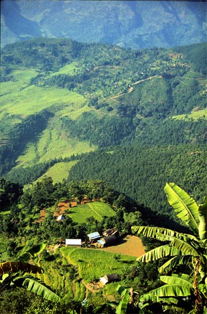
It's pretty good but there's no palm trees in Nepal
sssshhhhh nobody loves a corrector. go away.
-

 Cornshot
Offline

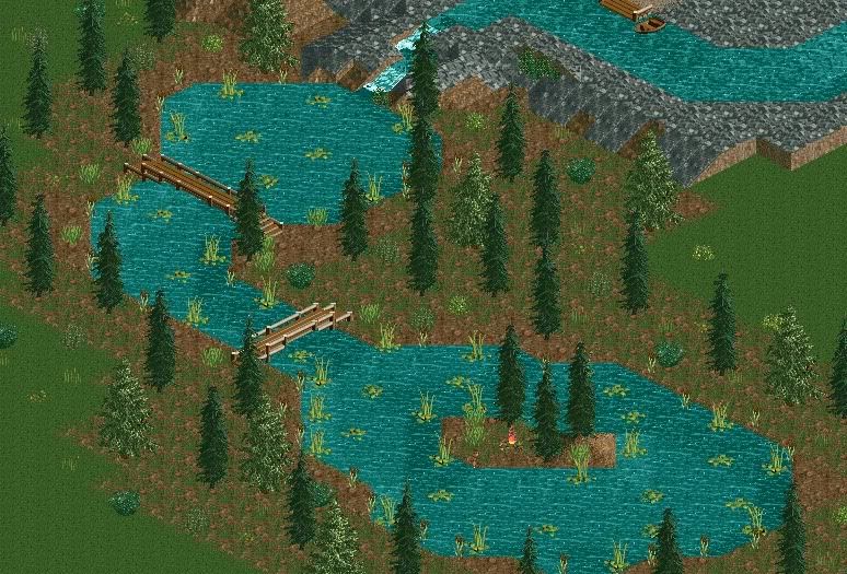
I was hoping to get a little advice on my newest work. I have been visiting this site often and I think I have really been improving since before I found this site. This is not completed yetEdited by Cornshot, 05 January 2010 - 11:38 PM.
-

 Cocoa
Offline
That's pretty nice. The foliage is OK in an overgrown sense, but does it fit with the general theme? The station roof also seems a bit flat...
but this is just from what I can see -

 SSSammy
Offline
well i think its charming liam.
SSSammy
Offline
well i think its charming liam.Cocoa, on Jan 6 2010, 02:34 PM, said:

pretty rationalThat's pretty nice. The foliage is OK in an overgrown sense, but does it fit with the general theme? The station roof also seems a bit flat...
but this is just from what I can see yeah it does fit with the theme, hopefully all will become apparant when you see it on the honary mentions list (
 ) the station roof is meant to be flat, thats how it was envisioned, but if you dont like it, thats pretty fair.
 Louis!, on Jan 6 2010, 02:54 PM, said:

YES! FINALLY! hahaa thankyou.shammy that is awesome. i love <3
posix, on Jan 6 2010, 04:55 PM, said:

thankyou very much.looking good sam
 Tags
Tags
- No Tags


