(Archive) Advertising District / Dump-Place
-
 19-April 07
-

 Liampie
Offline
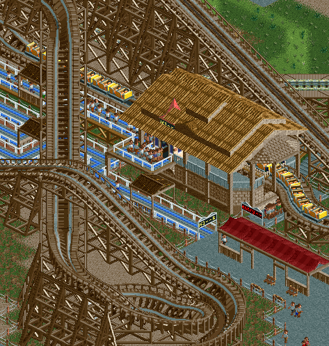
My second favourite Batman-clone so far, but you still have the best lifthill.
 Very nice.
-

 wheres_walto
Offline
Robbie that looks fantastic! I can't wait to see more.
Same area as the last one, obviously unfinished. -

 Steve
Offline
Robbie, great job on that station, dude! You're showing way too much, though!
Nokia, looks like a nice start. I really like the dirt for paths and the atmosphere is solid too. I'd suggest losing the palms maybe.
oh, and also, perhaps the brown building has too many roof textures? -

 J K
Offline
Some thick foliage framing that path would make it even better! Lovely architectural forms.
 -

 Liampie
Offline
The station looks okay (so far!). Why didn't you finish this area before posting?
Liampie
Offline
The station looks okay (so far!). Why didn't you finish this area before posting?Edited by Liampie, 02 January 2010 - 03:44 PM.
-

 Cocoa
Offline
I don't really like it, actually. It's a good start, but all the dark brown is really off putting, the roof seems to need more detailing, the path choices are ugly, as is the fence, and the random awning thing could be done a lot better, for example not random.
 -

 Splitvision
Offline
Yeah sorry but I can't really see why the screen is that great... Cocoa pointed out the most flaws.
I love your screen though Nokia. I'd only lower the arch thing on the light brown building a step or two.
 Tags
Tags
- No Tags


