(Archive) Advertising District / Dump-Place
-
 19-April 07
-

 JDP
Offline
Heh I would hope not.@JDP: I don't like the colours.
And everyone please listen to me because I only want to say this once. My Intimidator design is NOT a recreation. Thanks.
-JDP -

 Cena
Offline
Heh I would hope not.
And everyone please listen to me because I only want to say this once. My Intimidator design is NOT a recreation. Thanks.
-JDP
Who cares? It still looks bloody cool .
.
-
 rcwhiz11
Offline
These are all screens from a park that got erased from my computer about a month ago. There are a few other screen shots that I put in here a little while ago from this park. I had been working on it for over a year at that point. These are the only screenshots I have of the park and I did not know want them to just go to waste. Feel free to comment and critique as some of these might actually end up showing in the new park I'm working on. They were still unfinished at the point I took them.


-

 SSSammy
Offline
i scrolled from the bottom up and my brain was trying to decipher who would post screens like this.
i was very impressed.
well done man, cant wait for more. -

 Splitvision
Offline
I like the stadium alot, it has a more classic feel to it, though I don't understand what the benches are for, seems wierd to have seats not facing the arena. Also the diagonal part could perhaps be executed a bit better. The church is pretty, I think it would look good as a more standalone building (without the other building in the background).
 -

 JDP
Offline
It's very bland. Add a few more details to your structures to make them more interesting to look at. Your few screen you've shown before that were pretty good, so start executing your work like that again.
Ha, I just meant the way I discolored the screen, but thanks man.Who cares? It still looks bloody cool
 .
.
-JDP -

 BelgianGuy
Offline
Liampie, that archy in the screen isn't ment to be a theme, that part isn't with the asia section of the park, its just a little mainstreet at the entrance of the park.
Believe me when I say there will be some themeing in this park. -

 SSSammy
Offline
it all looks unfinished to me.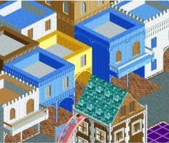
Please excuse that unfinished bit in the corner.
:s it looks really bland and kinda boring atm.
2x2 doesnt work here at all imo.
it looks like lego.
free up your architecture
-

 J K
Offline
Why are all your sentences always like this.
Seems pretty weird to me.
It puts me off reading anything you write.
Period.
Bulk up your writing
lol -

 SSSammy
Offline
haha sorry :L
i just hit enter when i have a new idea. its not like theres anything important in my posts anywy
-
 MF72
Offline
rcwhiz, I'm really liking that church, but I'm really hoping that the building behind it is unfinished, because as of right now, it's looking quite bland. Everything else is looking pretty nice, however.
Maverix, I'd have to agree with everything SSSammy says. Looks a little boring as of now. -

 MF72
Offline
Wow. Talk about a nice Christmas present.
Anyway, I'm not too sure about that wood like wall below the roof, or the peach on the station. It's definitely great, though. -

 JDP
Offline
Transfer track don't work dude. Either extend it or cut some details of the station off.
Looks great through bobby, really nice work. Just fix up that problem.
-JDP
 Tags
Tags
- No Tags

