(Archive) Advertising District / Dump-Place
-
 19-April 07
-

 Kumba
Offline
JDP I am gussing it is not a coincidence this overview gets posted on pg 305?
Looks awesome, I hope this gets more people to do recs. we hardly see any these days and there were some great ones in the early LL days. -

 Jaguar
Offline
^^Why so you don't have to design a new logo, lol. Anyways I really think it looks cool JDP, and that looks great belgian guy.
Here is a screen of a possible design that I havn't touched in a year that prabably won't get finished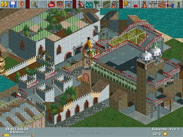
Edit: nin, looks good, but I don't like the blue colored walls.Edited by jaguarkid140, 22 December 2009 - 10:14 PM.
-

 CedarPoint6
Offline
For the record, it's not a recreation, Darren. It's really darn close, but there's a extra helix in there, which I think adds a nice finale to the layout. I'm all for the change as well as some of the height variations in the turn sections. Really looking forward to it.
nin- keep it up. I really want to see you finish something since your quality is always pretty high. -

 J K
Offline

Erm this is amazing. I agree with taking time out from the game does a player wonders.
Luketh and JDP both really good screens. I love the picnic area and entrance and exit signs.
JDP - just sick, the landscaping looks very unappealing at the minute so maybe work on it a bit more but I can see its at the initial stages.
Ahoy there matey!!! Very unfinished but you guys have really inspired me to post this.
EDIT- the waters edge is sorted now. -

 nin
Offline
So awesome J K, if only it was functional! Perhaps change the gray backdrop to resemble the ocean or something?
 -

 Stoksy
Offline
How did you build the benches and rubbish bins on the path?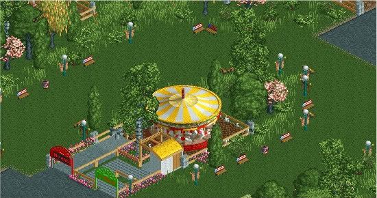
J K: Awesome! Is it a functional ride? -

 J K
Offline
I wish it was functional but I'm not that good lol.
He did the benches on invisable path. -

 SSSammy
Offline
JK im sure ive seen that before in an earlier incarnation...
maybe have you shown it on msn?
its fantastic. really inspiring.
i agree with nin on the ocean thing. -

 Luketh
Offline
Stoksy- it's really easy once you know what to do.
You just build an invisible path wherever you want it... then you click "height marks on path" and little green squares show up with the height of each individual path. Go to scenery and select whatever path object you want to go on the path, garbage can, bench, etc. and then place your cursor right on the green square with the height on it. -

 SSSammy
Offline
i dont really get it jag.
its just really damn messy, and i know that what you were going for, but its not working for me. maybe others will enjoy it, not muy cup of tea. -

 MF72
Offline
I'm unsure what the theme is here, Jag. It looks like some kind of outer space medieval castle. Not to mention the clashing of textures.
I think you need to work a bit more on it. -

 Liampie
Offline
@Turbin3: Blocky and cliche. You can do much better!
@Belgianguy: The architecture looks too generic to be a theme and looks too decorated to be generic if you know what I mean.
@JDP: I don't like the colours.
@nin: Great, changing the colour of the blue walls would make it greater. It blends with the glass too much.
@jaguarkid: It doesn't look like you had a vision or idea when you started, more like chaotic and random.
@J K: Cool. Not sure about the background actually, It doesn't really serve a purpose and maybe it would look better without it. Or paint the wall like nin suggested. Good to know you're not stopping after Dreamport, assuming this is another project. Very good!
@Luketh: Pretty good, but I don't like how the peeps are forced to walk on the grass to get to the other side... I'd use normal path on the right side of the carousel and keep the rest. -

 Luketh
Offline
^
Good idea, it never occurred to me that peeps might not want to walk in the grass, thanks Liampie. I'll add some nromal path, too. -

 nin
Offline
Jag, you've got to realize that sometimes you're just not going to get comments on your screens. It happens to everyone.
 Tags
Tags
- No Tags


