(Archive) Advertising District / Dump-Place
-
 19-April 07
-

 Luketh
Offline
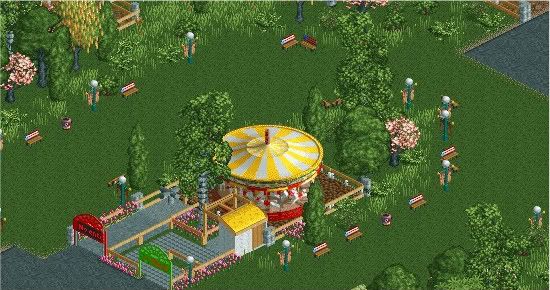
Cool, Trav... I think you could go either without the fence, or with breaking the fence a little to make it seem more run-down.
 -

 Splitvision
Offline
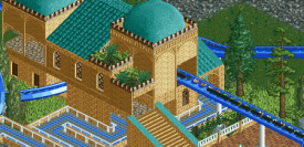
Fantastic screen Trav! Great mixture of the brown shades. Just one thing, maybe the building above the water could use a splash of another colour. Other than that, lovely.
Sam - I meant having a second floor as wide as the tower, just behind it... still hard to explain it lol -

 trav
Offline
@ Liampie - The medieval ones and this one are from the same park. Other ones aren't.
@ Cornshot - Yeah, the overall feel I'm going for is an IOA POE type feel, seeing as this park is called 'Trav's IOA', and from the pictures I've seen, this is a pretty good representation of it.
@ In:Cities - Thanks
@ Luketh - Thanks. I'll have a play around with the fence, I preferably want to make a custom fence, but I'm quite worried that if I start fiddling around with things like that, I'll hit the object limit.
@ Posix - Thanks a lot. It's always nice to hear one of the big ones compliment your work
@ JKid - Thanks.
I'll give a bit of info on the park. I'm not going to be starting a topic for it. I want all the screens to be in the dump place so people forget about them by the time the park is released. The park is my idea IOA style park. Themes are POE, China, Medieval, Manhattan and the last area is a surprise It's about 40% done at the moment, but this is the fastest I've ever built on a project. I reckon I can probably finish it by early March.
-

 JDP
Offline
Thanks for the comments guys.
And Trav... dude taken that time off away from the game did you wonders.
-JDP -

tdub96 Offline
Luketh---not so sure i like the entrance and exit banners, but i like the whole "picnic area"thing -

 Cornshot
Offline
The foilage around the picnic area looks great. I have to agree with tdub96 about the entrance and exit banners.
 -

 BelgianGuy
Offline
worked a little on the screen from yesterday,
Imagine yourself walking through the entrance of a park and having this in front of you...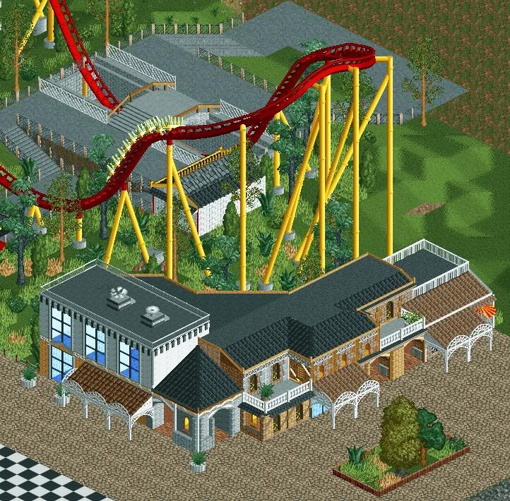
-

 SSSammy
Offline
shit hot.
i guess it would have been fairly challenging to hide what the layout was anyway
-

 Luketh
Offline
Tdub- thanks, I'll mess around with the enterance banners a bit...
Nokia- Yes. I looked at one of your parks and the lightbulb above my head went off when I saw it.
Cornshot- Thanks, and as I said above, I'll mess with the banners.
Belgian Guy... that looks a lot better, and the archy is looking good. Foliage could use some work, especially the planter.. why would there be dead grass in a planter? But imagining walking into a park with that in front of me... I'd probably pee myself, not gonna lie.
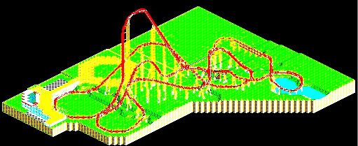
Looks like a pretty true-to-life layout, JDP. Can't wait to see what you do with it. -

inVersed Offline
I love how smooth the first hill looks. One of the best Giga hills i have seen in RCT -

 In:Cities
Offline
belgianguy, i can honestly picture myself being there and looking up and being like, oh my god.
that looks amazing bud:]
JDP, that looks awesome as well.
i'm pretty intimidated
 Tags
Tags
- No Tags


