(Archive) Advertising District / Dump-Place
-
 19-April 07
-

 Luketh
Offline
Looks good, Belgian Guy, but as Xophe said, I think the default fence colors would look better. Also, it'd be pretty easy for little kids to fall into that pit and either die from the fall, be stuck or land on the tracks and get totally splattered. Sick mind, maybe.. but it could still happen, add a fence right there or something... for the peep's sake.
Nin... just wow. The #1 zoo in RCT2 right now... looks great.
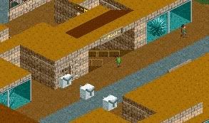
EDIT: Oh, Nokia added a pic, too. I love it, but I don't really like the 2nd arch at the entrance... seems unnecesary and makes it look too tall. Also, the way the benches and lamp are conflicting with the fence looks strange. Try putting the fence on the other side of the tile, if you know what I'm trying to say... that way it would be in the same time as the queue, I think that'd help the look of the screen, cleaning it up.Edited by Luketh, 21 December 2009 - 07:09 PM.
-

 nin
Offline
You know what I think nokia, but maybe lower the archway and add path..
.. and thanks burns and luketh. -

 J K
Offline
Nokia I like that screen a lot more. I really like the idea of walking on a natural path that can resemble the ground. What were your intentions for making it look so natural, I'm curious?
Nin - Beautiful as always, seriously you are good.
Belgian Guy - Nice support work. If you change the colours of the coaster so they aren't so obvious I think it will fit in with the area a lot more. Also the fence matching the coaster doesnt help so much. -

 Jaguar
Offline
Looks good, Belgian Guy, but as Xophe said, I think the default fence colors would look better. Also, it'd be pretty easy for little kids to fall into that pit and either die from the fall, be stuck or land on the tracks and get totally splattered. Sick mind, maybe.. but it could still happen, add a fence right there or something... for the peep's sake.
Batman the Ride? Lol. Some idiot jumped the fence and lost his head while standing under the coaster. -

 Nokia
Offline
Nokia I like that screen a lot more. I really like the idea of walking on a natural path that can resemble the ground. What were your intentions for making it look so natural, I'm curious?
oh, i just haven't put path in yet... like the path scenery or whatever.
but idk, i might just leave it as is. -

 J K
Offline
It's a different approach to something and it actually works really well here. Bit annoying that it wasn't your intention though, I thought you were onto some bold brilliant masterpiece
-

 Nokia
Offline
It's a different approach to something and it actually works really well here. Bit annoying that it wasn't your intention though, I thought you were onto some bold brilliant masterpiece

i can always leave it like that for you <3 -

 Liampie
Offline
@Belgianguy: There are fences everywhere, except for where they're really needed: by the tunnel. The pathtype doesn't fit in this setting. The rest is pretty good!
@nin: Please stick to using custom objects; it looks SO MUCH better! Seriously, the first screen is godly!
@Nokia: Unfinished? I can tell. I dislike the fences.
@Cornshot: I have no idea what I'm looking at. You managed to create chaos with very few objects, well done!
@JDP: I love that.
@Welshcraft: I like the colour scheme but the area doesn't seem finished... Make the foliage thicker and add more bushes.
- - -
This is from a park I made for the RCT-Guide Summercontest 2008. It wasn't meant to be at the same level as the rest of my work back then, but I didn't intend it to be this bad. It was an experiment and it failed hard. The concept was lacking so I made another park and submitted that one, Colorbomb.
I'm posting old stuff all the time because I'm closing the old chapters. -

 J K
Offline
i can always leave it like that for you <3
Hahaha if you want to. i just think from a persons point of view walking on a dirt path in a natural environment would be such a good theming aspect. What can I say I'm a graphic designer, everything needs to be themed! haha.
JDP - Sir thats some pretty good architecture you have there.
Liampie - You will benefit so much from closing the chapters so to speak. Very good idea. -

 Cornshot
Offline
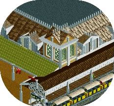
Keep in mind that it isnt close to finished. It will eventually be indoors with actual good roofs. I am also trying to fix some the bad walls. Thanks for the advise.@Cornshot: I have no idea what I'm looking at. You managed to create chaos with very few objects, well done!
Edited by Cornshot, 22 December 2009 - 09:52 AM.
-

 SSSammy
Offline
i tried the real roof thinkg before this one. honestly man, i was ashamed. it was just monotonous and boring. could you explain the second floor bit again? :SI think the roofing is a bit wierd... I think that particular building would benefit from having a "real" roof instead of the grey flat thing. I really like the tower, it might need just a tad bit more supporting, otherwise it's very pretty. One thing I think might work is having a second floor, sticking out from behind it, if that makes sense.
thats for the comment
no worries, by all means think its boring, dont like it for the hell of iti want to like it, it just seems kinda boring in my opinion.
foliage is nice though.. i don't really know what to suggest to make it better, sorry hammy

thanks for the comment.
do you?I think the tower roofing is a bit too tall scale-wise.
personally i think its fine, so im not going to risk modifying it for now.
ill show a screen when its more complete and if the concensus is that it looks wrong ill change it.
thanks for the critisismLovely foliage, but the tower needs a little more detail but this can be very hard since you have a big flat space with the diagonal shape, also try to make the path loo less boring.
The cauldron planter is a great idea I must admit
ill try and sort that out.
how dare you.What's the purpose of that building? It always seems to me that you have random buildings along paths.
-JDP
-sssammy
like i said to split, youll be glad i showed it like this. its just not the right shape for that kind of roofing. do you maybe thing turrets would be better?I really like that Sammy. But I agree with Splitvision about continuing the red slanted roof across the whole building instead of the flat roof. And the bit of steep roof in the middle of the shallower roof looks a bit odd... Foliage is ace. Nice custom fencing too. The path looks a bit boring... maybe if you get rid of the plain grey bits of wall that stick out into the path (which are a bit unnecessary) you could put some benches and lamps and stuff up against the building?
i like the plain grey bits its exactly what i was going for. im going to completely ignore you here and risk keeping them in
  maybe on a grander scale i might seem less retarded
  thanks for the comment Christophe
i like them better too.Unfortunately it looks like that foliage is becoming standard here
I blame RRP for starting it all
Really though, am I the only one who likes the standard trees more than these ugly custom ones
in LL foliage is so so so fun.
i just like these trees too.
i see where you are coming from.I'm with you there comet, custom trees will never out do the originals.
-

 Liampie
Offline
Trav, I love it! My favourite screen from you so far. Are all these recent screens from the same project?
 -

 Cornshot
Offline
That looks great Trav. The foilage and landscape look wonderful. It looks cool how in some spots on the building there is brick exposed.
Cornshot
Offline
That looks great Trav. The foilage and landscape look wonderful. It looks cool how in some spots on the building there is brick exposed.Edited by Cornshot, 22 December 2009 - 10:58 AM.
 Tags
Tags
- No Tags


