(Archive) Advertising District / Dump-Place
-
 19-April 07
-

 Milo
Offline
For those LLers out there... Can someone give a poor RCT2er some advice about this?

yeah uh don't let the meh reactions fool you ,this is damn good stuff... really enjoyable and fresh
I agree the path might be a little off and some of the mini mouse track could go (the turns). Try using mini golf stations and maybe even sink some path to give a true covered walkway feel. The glitchy stuff on the paths is a little meh, there's a way around it too but it's all in the order you build stuff (I can't remember exactly but I think it's what is on a tile first "overrides" whatever you zero clearance onto it so it will glitch... I'm going to assume you built the path first and then tried to put the trees on it... try the opposite and see if that works out.)
show more LL please, I'm very interested
Cool stuff rK.... looks like Arnos or Snowdrop or somethingEdited by Milo, 21 December 2009 - 01:11 PM.
-

 Splitvision
Offline
I'm gonna have to disappoint you Liam, I raised the footers above water level and I decided it looked like shit. It might be less realistic the way I have it now, in that case fuck realism
-

 Bacchus
Offline
Thanks for the comments Liam, Split and J K.
I did some small changes on the rooves on the right.
It's in the same park as the Droomvlucht screen i showed btw .
.
-

 Splitvision
Offline
I think the roofing is a bit wierd... I think that particular building would benefit from having a "real" roof instead of the grey flat thing. I really like the tower, it might need just a tad bit more supporting, otherwise it's very pretty. One thing I think might work is having a second floor, sticking out from behind it, if that makes sense.
 -

 Nokia
Offline
i want to like it, it just seems kinda boring in my opinion.
foliage is nice though.. i don't really know what to suggest to make it better, sorry hammy
-

 BelgianGuy
Offline
Lovely foliage, but the tower needs a little more detail but this can be very hard since you have a big flat space with the diagonal shape, also try to make the path loo less boring.
The cauldron planter is a great idea I must admit -

 JDP
Offline
What's the purpose of that building? It always seems to me that you have random buildings along paths.
-JDP -

 Xophe
Offline
I really like that Sammy. But I agree with Splitvision about continuing the red slanted roof across the whole building instead of the flat roof. And the bit of steep roof in the middle of the shallower roof looks a bit odd... Foliage is ace. Nice custom fencing too. The path looks a bit boring... maybe if you get rid of the plain grey bits of wall that stick out into the path (which are a bit unnecessary) you could put some benches and lamps and stuff up against the building?
 -

 Comet
Offline
Unfortunately it looks like that foliage is becoming standard here
I blame RRP for starting it all
Really though, am I the only one who likes the standard trees more than these ugly custom ones -

 BelgianGuy
Offline
Just got started recently on a new solo project wich since TPLA is bust till further notice,
Main attraction of an Asian themed area is this B&M hypercoaster
Meet EMPEROR...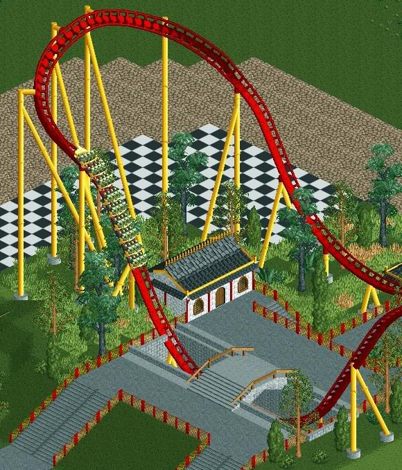
Note: very unfinished as most of you can tell -

 Xophe
Offline
"I'm with you there comet, custom trees will never out do the originals."
but those little mushrooms are the best custom object ever haha!
edit: too slow!
Belgian guy that is amazing! But the fence colours are too much I think. The default colours would look better.
 Tags
Tags
- No Tags
