(Archive) Advertising District / Dump-Place
-
 19-April 07
-
 Timothy Cross
Offline
Hopefully this is all that needs to be said since it's my park.
Timothy Cross
Offline
Hopefully this is all that needs to be said since it's my park.
MF72- You are perfectly welcome to your opinion but as others have said people build the park they want to build. I want to build this park and don't worry about me executing it correctly. You'll either like it or you won't, but you can't tell me not to build what I desire to build. Now please, let us drop this.
Though I will say... floating park? I ain't sayn' nothn' right now.
-
 geewhzz
Offline
geewhzz
Offline
Does anyone know where I can get (a stable version)of 8cars? The old site shut down and I lost my other version on another computer.
http://rctarchive.co...s/8cars1302.rar -
 tracidEdge
Offline
hey yall just stoppin in to raise some shit, what's going on?
tracidEdge
Offline
hey yall just stoppin in to raise some shit, what's going on?
ps mf72 kill yourself, thank -
 SSSammy
Offline
SSSammy
Offline
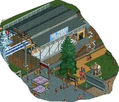
In the meantime, Stuff from a Six Flags park.
afew things...
in the first screen, it says intamin on the sign, id probably remove that cause it looks awkward. nice station though.
also, why the sand coloured path?
the next screen is nice, if rather square, but thats okay for now. -
 Xophe
Offline
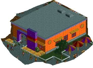
I agree with Sammy about not having 'Intamin' written on the sign. You never see the manufacturer written in huge letters like that in real parks. I like the colours of the orange building but the shape is a bit dull. Maybe try doing something with the roof?
Xophe
Offline
I agree with Sammy about not having 'Intamin' written on the sign. You never see the manufacturer written in huge letters like that in real parks. I like the colours of the orange building but the shape is a bit dull. Maybe try doing something with the roof? -
 Louis!
Offline
Am I the only one that doesn't see what's different with Liampie's screen?
Louis!
Offline
Am I the only one that doesn't see what's different with Liampie's screen?
Looks the same as all his other work to me. Which isn't a bad thing just don't understand why this is different. -
 posix
Offline
posix
Offline
hence my sarcastic replyAm I the only one that doesn't see what's different with Liampie's screen?
Looks the same as all his other work to me. Which isn't a bad thing just don't understand why this is different. -
 jusmith
Offline
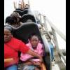
I really love the colours/textures, and the atmosphere is great, but the coaster looks really forced here.
jusmith
Offline
I really love the colours/textures, and the atmosphere is great, but the coaster looks really forced here. -
 Midnight Aurora
Offline
It's incredibly plain. There's absolutely no landscaping and the trees are randomly placed. Use the scenery to focus my attention. What are you trying to accent? Where do you want me to look?
Midnight Aurora
Offline
It's incredibly plain. There's absolutely no landscaping and the trees are randomly placed. Use the scenery to focus my attention. What are you trying to accent? Where do you want me to look? -
 JDP
Offline
DH you should know better by now about what looks boring and what looks entertaining.
JDP
Offline
DH you should know better by now about what looks boring and what looks entertaining.
-JDP -
 Splitvision
Offline
Yeah sorry DH but that's way too basic, and dull. It gives the atmosphere of not having being visited for 100 years. And I don't mean that in a good way, like you achieving the abandoned mine feel, but like the actual park itself is abandoned... sorry if that sounded harsh.
Splitvision
Offline
Yeah sorry DH but that's way too basic, and dull. It gives the atmosphere of not having being visited for 100 years. And I don't mean that in a good way, like you achieving the abandoned mine feel, but like the actual park itself is abandoned... sorry if that sounded harsh. -
 Comet
Offline
I actually really like it, although I'm a very boring person
Comet
Offline
I actually really like it, although I'm a very boring person
I suggest breaking up the path though, maybe change the shape of the station a little bit to make it more interesting, and do work on the foliage


 Otherwise I would have done it myself


Tags
- No Tags