(Archive) Advertising District / Dump-Place
-
 19-April 07
-

inVersed Offline
I have been trying the "ultra"-realistic style again, this time with a full park...
heres an early screen of the parking lot and the tram station.. im pretty proud of how the station turned out and the handicap signs.
-

 muuuh
Offline
nice parking lot. but I`m just missing some trees and bushes. probably u can change the fence in an another one, because the fences doesn`t fit together with the rest imo.
 -

 posix
Offline
sure it's very nice.
but you couldn't stop yourself from doing those jagged rocks, could you?
your origin, son, is semi-realism.
i tried to fight it so badly in my own parkmaking.
in the end it just made me unhappy and i stopped playing.
good luck. -

 postit
Offline
I think they are supposed to be bus or RV spaces, but they seem a bit far away from the park. Nevermind, they are close to the handicap spots, which is where they should be, so it can't be too far away from the park entrance.
Those jaggedy rocks do look kind of off, as posix has mentioned, but I'm sure it will be ok when you do your planting and treeing. It's not perfect realism, but it's also not THAT big of a deal, I don't think.
By the way, make sure you have a lot of handicapped spaces. These days people just borrow their grandma's permit and use it to try and park up front, and it's quite disgusting how Americans don't want to walk from the standard spaces and would fabricate an intricate lie to save 5 minutes of walking.
Another thing to maybe think about in your parking lot are preferred spaces, or premium spots near the gate.
Also don't forget to label the RV spots so stupid Americans don't park there! Don't forget an elaborate toll plaza.
Ok, I'm done. Looking good. Tram station is spot on. -

 JJ
Offline
^ Nice Support work man.
Obviously the guests don't see the staff building and parking and stuff but they do see this sign. And I need you German guys to help...
Willkommen doesn't fit... Hence why I've made into a somewhat readable Wilkomme...
Basically I need a shorter way of saying Welcome in german that will fit on the sign... Needs to be 8 letters or less. Any ideas?
Or I could put the german with the dutch and the english with the french... now why didn't i think of that...
but if you still have any suggestions...Edited by JJ, 20 August 2007 - 05:29 AM.
-

 Milo
Offline

"Wait, so you guys live... in the clouds?"
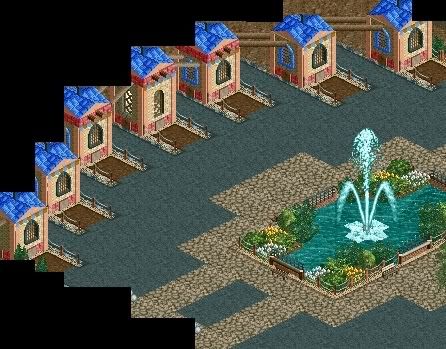
Unfinished.
This is really nice. A neat idea and pretty well executed too. Maybe have clouds like that on every inversion as well? Oh and the cloud could be a little more 3D as well right now the flat way it is seems a little off.
I would say watch out putting windows on every wall but it's such a small building that it doesn't matter too much here. -

RMM Offline
good idea zodiac. could be a little more cleaned up
and maybe a little more natural looking. but yea.
great idea. -

 zodiac
Offline

"Our transportation system is held up by the clouds we live on, and when you reach your stop, just unhook the latch and jump. Just hope you don't fall..."
 Tags
Tags
- No Tags


