(Archive) Advertising District / Dump-Place
-
 19-April 07
-

 K0NG
Offline
I see it as more of a gimmick than anything else
I think that some people use it as a 'gimmick'. Some (like nin) actually enjoy pushing themselves creatively and forego using CSO's and say to themselves "look what I did with no CSO's" while I think some people do it to hear others say "look what he did with no CSO's". That's where it becomes gimmicky.
Bottom line....if you enjoy it (or ANY style of playing RCT) by all means, do it. If you're just looking to have your balls washed by others praising your creativity....use the fucking objects, you know you really want to. -

 Louis!
Offline
RMM - thanks.
Nin, I don't enjoy that screen. It's probably just the colour, the yellow doesn't seem to match the texture and seems too bright for what you are doing anyway. I know it would look better with CS, but I understand why you want to build without them
-

 posix
Offline
This was the kind of problem I was in when I built some last month. My conclusion though was that I have to be clever enough to choose objects and paths so wisely that even without hacking (ll) or CS (rct2) I can achieve the effect I want and thus trick the creative limits. This is what I find the hardest about playing the game and the most impressive when others do it.Its not a problem,its just that it generally doesnt look good or seems like a waste of time.For example if you wanted to have a tarmac texture on a roof would you mess around making a larger piece of path for the roof then lower the edge pieces (like in LL) or would you simply use the object thats been made for that task?It just seem like a waste of time to me
Its like saying your not going to use a trainer for a park and hindering yourself creatively
I see it as more of a gimmick than anything else -

 LDW
Offline
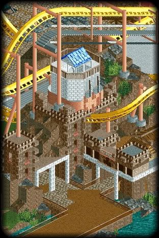
DelLagos: great work. However, like RCTNW said, there may be too much detail. What the size?
 -

 DelLagos
Offline
Thanks for the comments.
I think I will redo this diagonal part of the left building. It seems a little bit displaced in my eyes too. Mapsize is 100x100 I think. -

 SSSammy
Offline

chances are you guys wont enjoy looking at this screen as much as i did making it.
bloody good fun with a design with no hacking whatsoever.
started off as a test of my skills, and a bid to improve them by restricting the capabilities even further. may seem counter productive, but its resulted in hours of fun when i was meant to be doing english coursework. -

FullMetal Offline
You built something and didn't even bother to show the rest of the community? How selfish of you...This was the kind of problem I was in when I built some last month.

-

 jusmith
Offline
"We present new Silver Flying Machine for you."

Thoughts? I am still messing around with the supports, but hopefully I'm on the right track with this thing. -

RMM Offline
looks nice. i like the colors. just wondering what that first drop looks like since i can tell it isn't steep the whole wayh. -

 Steve
Offline
Are chain returns on flyers typically underneath the catwalk? Interesting. Definitely looks great though!
 -

 geewhzz
Offline
that's not a chain return it's the motorized device that brings up the emergency evac car to the train.
 Tags
Tags
- No Tags


