(Archive) Advertising District / Dump-Place
-
 19-April 07
-

 Nokia
Offline
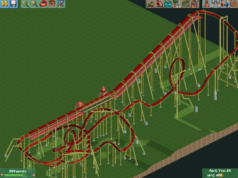
no, i can't make it bigger, cause then i'd have to rework the whole ride, and i like it how it is.
-

 J K
Offline
Robbie its up to you what you show but just don't become too involved in getting compliments rather than releasing work. You have what two solo releases and how many projects gone unfinished? I dunno maybe its just me pushing you for better things.
 -

 CedarPoint6
Offline
Realistically, you'd want a lot more supports on that ride. It's quite undersupported. There's not much there, but it's decently interesting. I'm sure there's something you can do to add some more things to it-- or color at least. More small kiosks on the path or something would be nice.
 -

 robbie92
Offline
Jonny: I actually want some tips on the archy. I'm going out on a limb and trying a new style for me, so I'm trying to see if it works. Besides, I only have one solo release...
-

 Steve
Offline
Glad you took my advice on that area, Rob. Really opens up ideas and you used the space more than adequately. Awesome job.
Nokia, Cena, sixflagsfreak56: All very solid screenshots you have there. -

RMM Offline
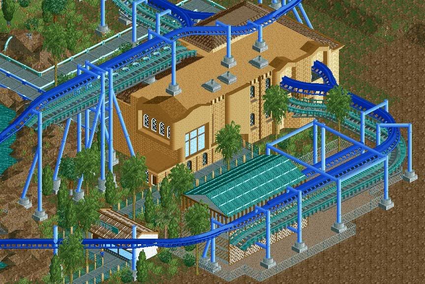
robbie, that screen really made me stop and look for a few minutes. as for the textures, i think if you change that pinkish/tanish brick, it could look much better. other than that, wow. -

 Goliath123
Offline
I think its really ugly.
Everything else on this page is great, really like your screen Cena!
EDIT: God damnit, best slow post ever. I meant samurai is really ugly lol, and eveything on page 281 is great.
I just think that your station is a bit too brown, maybe add like a wave effect on the walls?Edited by Goliath123, 15 November 2009 - 02:22 PM.
-

 SSSammy
Offline
that is perfect for a station.
just some more details and that will be a fantastic station. -

 robbie92
Offline
^^Wow. Great comment.
It looks nice BelgianGuy. The only thing I would fix would be the footers in the roof. Those would only be on the ground. -

 Jaguar
Offline
Too much brown on the station, for my picture, I'm surpirsed that no one noticed how it is a batman clone. Though it is really ugly, any suggestions for a correct color scheme?
 -

 Liampie
Offline
You're improving really quickly, I like the station. My only comment is that everything seems to be oversized.
 -

 BelgianGuy
Offline
The size is fine compared to the coaster, i'm really looking out for overall scale, And robbie what do you think I schould do with those supports on the roof? just remove the footers and make support all the way down?
 -

 sixflagsfreak56
Offline
I'm surprised that no one noticed how it is a batman clone.
Thats because thats not how the layout goes...
 Tags
Tags
- No Tags


