(Archive) Advertising District / Dump-Place
-
 19-April 07
-
 Camcorder22
Offline
Looks pretty good but maybe a little close to the edge of the map and the water. Its going to look pretty wierd to make a path go over that river. But the building looks pretty good
 -

 RCFanB&M
Offline
Not necessarily. Lineair Gale (the prototype) had two non-twisted spikes and Wicked Twister contains two of them. Maybe he's going for a version based on that last one?
Ah, had forgotten WT and I didn't think of LG, because like you said, it's a prototype...but yeah, you're right.Edited by RCFanB&M, 13 August 2007 - 10:08 PM.
-
 Loopy
Offline
OOh a wingwalker that looks really nice CF. I love it.
rcwhiz11, get some paths on that entrance and itl look really good. -

 posix
Offline
cf, there's something about your style that's just so alluring, i can't quite make sense of it.
well done. -

inVersed Offline
That station is very appealing CF... the only thing i can find wrong with it is how tiny the loading area is, however i understand you have to compromise sometimes in RCT to make some things look good.. so good work -

 FK+Coastermind
Offline
i like alot about that screen! the only problem for me is that the actually original station is showing so much. i think maybe if you build the blocks up one the station would look more like part of the rest instead of a giant platform that no peep could get to.
FK -

 CedarPoint6
Offline
A little project i'm working on
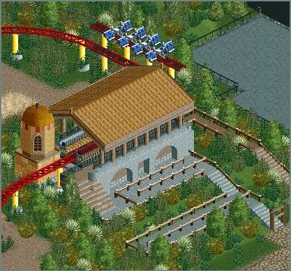
Very nice, although I believe you need to put railings up the stairs. Also, the transfer track has no way of shifting onto the actual track. It can't happen right now from what I see. Still, I like the station and everything-- it looks very nice.
@ Sûre: Cool, but what's it supposed to be? -

 FK+Coastermind
Offline
Personally i think it is much harder to go from LL to RCT2. LL requires such creativity that you can take the smae pieces you had in the last park and use them all to make something completly different. with RCT2 you have so many helpful pieces. thats why IMO RCT2 has evolved so much. with all the pieces creativity was used to make things better and more real(thus kinda leading to the current realistic stage in RCT2)
FK -
![][ntamin22%s's Photo](https://www.nedesigns.com/uploads/profile/photo-thumb-221.png?_r=1520300638)
 ][ntamin22
Offline
not too bad. would probably look better if you found a better way to support the track- the hinged supports especially just kind of look bad.
 Tags
Tags
- No Tags
