(Archive) Advertising District / Dump-Place
-
 19-April 07
-
 Jaguar
Offline
Yes, this is a compact volcano styled coaster. This isn't the first intamin invert I have tried either, the other one was an Intamin SLC.
 -

 frdalton
Offline
First I should say that I'm new to doing proper scenery with RCT, played the game for years, but never even thought to do some of the things I've seen on this site,
That being said, I'm trying to do something with this station and can't seem to figure out what i'm missing,
First, I'm trying to decide on the foundation, there's a few different options in this shot,
Secondly, any suggestions on the rest of the building? -

 Splitvision
Offline
First, welcome to NE! It can be scary at times but we're actually nice guys. Apart from tracidEdge. Watch out for him.
As for the screen: It's not bad, but some things you could do to improve it is:
Mix the shape up a bit, so that it isn't perfectly rectangular.
Experiment with some more different texture combinations, not too many though since it can get messy.
Make it have two or three main colours, with one or a few details in an additional colour.
Make it look a bit more supported, right now the roof look a tad bit too heavy.
Add height variations.
Just be careful as to not overdo any of these things. If you add too much stuff that really doesn't fill a purpose it will make it worse, rather than improve it.
anyhow it's a good start, just keep working on your style, listen to the feedback (especially mine ) and you'll improve, guaranteed.
-

 frdalton
Offline
How's this?
I couldn't figure out a way to make it look more supported and keep the open look I was going for, still not liking it though... -

FullMetal Offline
That looks very nice. I like the planter box around the perimeter. You should put full-tile or quarter-tile blocks underneath the queue, though. That way it'll look like the station actually has a floor, instead of just dirt. -

 Splitvision
Offline
Definitely better, interesting solution to lighten up the roof instead of reinforcing the supports... but you should add some kind of beams to the roof, otherwise it looks like the boards are floating... Now you would maybe like to add some small details to spice it up a bit.
 -

 Comet
Offline
I'd say only have the planters going horizontally across the front and get rid of the vertical ones
It's too much right now -

 Splitvision
Offline
Very nice FM, good job! It looks very believable. Only suggestions are considering making the cafe/restaurant have wooden floor, and to recolour the windows on the top floor, especially the shutters, and maybe use another wall than the large brick wall by the water. Other than that, really pleasant!
 -

 frdalton
Offline
How's this?
Think I got most suggestions applied here...
I also did some work on the scenery around the ride itself, not supposed to be a crazy coaster, just a kiddy ride. -

 JDP
Offline
Jag, I don't get it man. You seem to know a good amount about roller coasters, but every time you create one it's awful. I don't see how your version of an Intamin inverted blast coaster can even be considered realistic in anyone's eyes. Come on dude, you have a mini top hat in the middle of a god damn inverted coaster design. Not even sit down coasters have that man.
You need to spend more time doing your homework instead of last minute studying.
-JDPEdited by JDP, 12 November 2009 - 09:49 PM.
-

 Jaguar
Offline
Jag, I don't get it man. You seem to know a good amount about roller coasters, but every time you create one it's awful. I don't see how your version of an Intamin inverted blast coaster can even be considered realistic in anyone's eyes. Come on dude, you have a mini top hat in the middle of a god damn inverted coaster design. Not even sit down coasters have that man.
You need to spend more time doing your homework instead of last minute studying.
-JDP
This is going to be more fantasy park. The layout looks really bad, but the ratings are both really intense (but below ten) and very high excitement. I wanted to add a creative element. If most parks consisted of boring beemer clones or headbanging compact Vekoma prefabricated Arrow Wannabees
  then that would be boring, wait...
frdalton, that screen needs alot of work, but it seems like a good start, though the layout is bad.
Anyways, with this park, I have released a new futuristic industrial theme: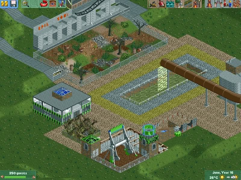
-

 In:Cities
Offline
while i usually like those kinds of big signs when they're pulled off right, i cant really say i like yours man.
theres not really much definition between the letters, and it took me a while to realize what it says.
if you're keeping it, i recommend working on the letter -K, because it looks a bit sloppy.
anyways, nice start so far man, and i hope to continue to see you improve. -

 frdalton
Offline
frdalton, that screen needs alot of work, but it seems like a good start, though the layout is bad.
Any suggestions? I've done more work on the foilage since that post, but would love any suggestions you can offer.
For the layout I know it's very basic but, this was actually inspired by a kiddy coaster I used to ride as a kid.
-

 RRP
Offline
i think the layout is fine for what your attempting.Id try and make the supports more accurately and position the trees in clumps rather than spread finely
 -

 Louis!
Offline
This is going to be more fantasy park. The layout looks really bad, but the ratings are both really intense (but below ten) and very high excitement. I wanted to add a creative element. If most parks consisted of boring beemer clones
 or headbanging compact Vekoma prefabricated Arrow Wannabees
  then that would be boring, wait...
The park may be more of a fantasy park but that isn't an excuse for crap coasters with no flow.
 Tags
Tags
- No Tags

