(Archive) Advertising District / Dump-Place
-
 19-April 07
-

 Cocoa
Offline
I'm not a big fan of the station- all the specific elements are really great like the doors and the spires but it is just a square with a flat roof...
 -
 Jaguar
Offline
MA...ya have to realize that this guy 'finishes' and submits parks as often as you and I empty our bowels. I think he's actually taking some time on this and truly wants input so that he might get past the minimum vote this time. If he wants to repeat shit until he gets the responses that he wants......
Yes, I need real responses, not fluff.See jag, that's what happens when you're impatient and insecure.
-JDP
What do you mean by insecure? Impatient, yes... -

 In:Cities
Offline
well man, if you would stop posting so many screens all the time and demanding feedback on them, then you wouldnt get as many pointless comments.
you're a decent builder, so i mean, just build what you like.
you dont HAVE to have feedback on every little thing you post dude.
reposting the same screen wont get you any decent feedback, it'll more than likely get you criticized.
just build what you like, look for a few suggestions and a little help, and have fun with it man. -

 SSSammy
Offline
Jkid, befriend someone on AIM or MSN, that way, you dont have to post so many screens to the world. ive added alot of poeple from NE and RCTPro and there is always at least 10 people online, most willing to give some decent feedback.
add me, im always willing to give impartial advice and critisism, regardless of what others think.
Bacchus, if you funky up the shape of that building, youre onto a winner.
just listen to what others have said and... yeah. -

 SSSammy
Offline
the transitions are all very short, maybe add in 1 straight track piece inbetween each element.
spike space station space half cobra space half cobra space loop space spike
hope thats clear
i agree entirely with gir -

Colorado-Fan Offline
@SSSammy:
I know, that the transitions are very short, but this is only a 50*50 park and it would look too big, if i would left more space between the inversions.
@gir:
thanks.
@Liampie:
I hope I can improve the lifthill supports. -

 prodigy
Offline
@ Colorado-Fan:
Die Supports an dem Looping / der Cobra-Roll sind viel zu niedrig und die Supports unter den Schanzen müssten Fächerförmig sein (also nur 1 Fundament, auf welchem dann alle drei stehen).
Und die Station ist zu kurz, nen boomerang hat immer 7 Wagen.
Ansonsten sieht's aber sehr gut aus, weiter so! -

 turbin3
Offline
Bacchus, I have seen better stuff from you in the past.
Still looks good, just a bit blocky. -

 Jaguar
Offline
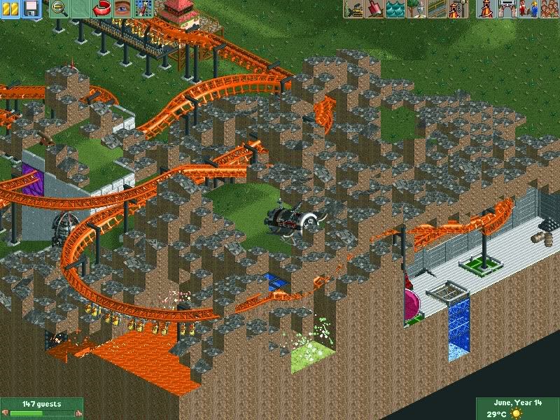
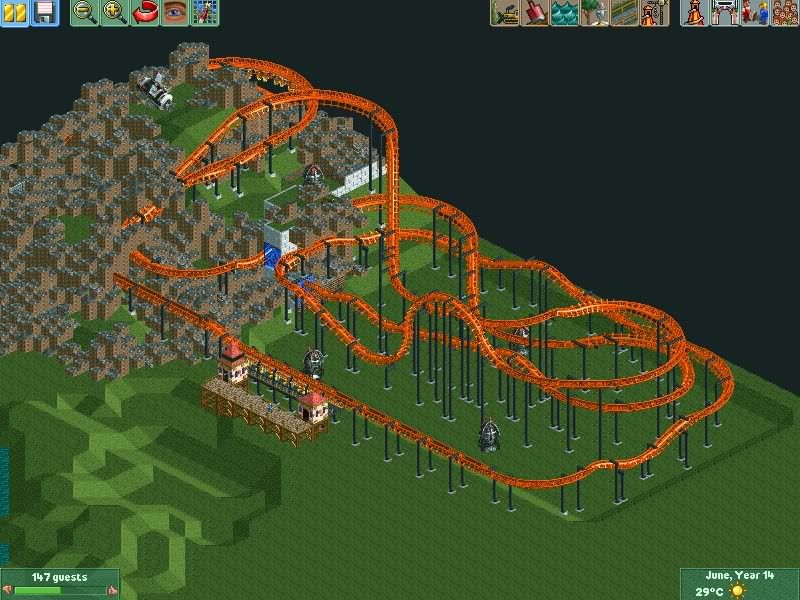
An Intamin Catapult Suspended Coaster
Shitty Logo made in like 2 minuits (Please ignore it)
-

 Luketh
Offline
If you want us to ignore your logo... try NOT POSTING IT!
Um... looks... interesting. The orange lava... I think you can do better with that, but the layout doesn't look bad... I've never heard of the coaster type before though, so I don't really know. -

 Jaguar
Offline
I've never heard of the coaster type before though, so I don't really know.
http://www.rcdb.com/474.htm
http://www.rcdb.com/1076.htm
http://www.rcdb.com/1101.htm

-

 Hepta
Offline
Cool idea jag, but the landscaping is pretty horrid at the moment. It looks like lego blocks. Try making it flow more.
 -
Xcoaster Offline
Try using the landscaping tool for landscaping until you get the hang of it and are ready for more detailing. Not sure about the layout yet (too many small height changes make it look rough), but nice job on attempting something like Volcano.
 Tags
Tags
- No Tags


