(Archive) Advertising District / Dump-Place
-
 19-April 07
-

 zburns999
Offline
Faas, the antique cars would tear that grass up pretty bad. I do see what you were trying for, though.
The coaster looks really nice, btw.Edited by zburns999, 08 November 2009 - 03:02 PM.
-

 gir
Offline
jag, I think you have good intentions with your supporting, but you really aren't sure of what you're doing. I mean, you recognize that the regular supports are wrong, which is fine, but then I look to the right-hand side of that overview and it's just plain bizarre and seemingly random. There are stretches of unsupported track and extra bracing where it's not necessary. The layout and foliage are both really uninspiring as well. My best suggestion is to take a look at real-life layouts and maybe even try to recreate one, so you can get a feel for how to build a realistic, exciting layout. Overall it needs a lot of work, but like I said, I think you have good intentions and good ideas, so keep practicing.
Faas, I really like that screen, but I think you should reposition the fencing because it doesn't seem to encompass all the track, specifically where the train is right there in the screen.
Nokia, it's gorgeous! -

 Luketh
Offline
Yeah, faas... The fence would be a foot chopper for the peeps, but some little kid who lost his hat while on the car ride could easily jump out of the car to get it and get his head knocked off.
That's kinda like what happened at SFOG, so yeah, might want to redo the fence a bit.
I love the colors and that screen in general, though.
Nokia, looks real nice... I should probably practice with my landblocks, too. -
 Timothy Cross
Offline
lol....
EDIT: Your an idiot JDP.
Angelica Lakes anyone?Edited by FantastiCo, 08 November 2009 - 07:31 PM.
-

 Timothy Cross
Offline
^^ Thank you.
Lowenaldo, I have no time anymore, but I will try.Edited by FantastiCo, 09 November 2009 - 09:03 AM.
-

 Midnight Aurora
Offline
Are you fucking kidding me? You've posted a picture of this same layout at least 5 times, and you still need more comments and more attention?Just thought I would re-post this
-

 K0NG
Offline
MA...ya have to realize that this guy 'finishes' and submits parks as often as you and I empty our bowels. I think he's actually taking some time on this and truly wants input so that he might get past the minimum vote this time. If he wants to repeat shit until he gets the responses that he wants......
 -

 Louis!
Offline
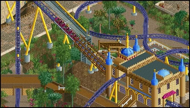
The station walls are flat faced and the station itself is quite boxy.
The barrel roll or zero-g through the station building seems a bit weird. If it was going over the station surely you would want to enhance the element by making it more open a visable to the guests boarding the ride, so it was going directly over their heads if you understand what i mean?
Also the tunnel through the diagonal path seems very tight.
I love the track as a catwalk rail though, coaster colours are great, always been a fan of the purple/yellow combo, and the foliage is real pretty. -

 Fisch
Offline
@Pudding: There really isn't much too say about the picture but the landscaping does look quite nice. Add some plants though and maybe add some dirt patches for the plants as well because plants usually don't grow well on rocks.^^
@Bacchus: I love everything besides the station. The little turrets on the station are nice but seriously, from what I've seen your architecture usually is a thousand times better than this. The station is too boxy like Louis said. -

 Liampie
Offline
I agree with Louis, and the colours in the screen are lovely! Brightness4life.
edit: RESPECT VOOR JE AVATAR!
Edited by Liampie, 09 November 2009 - 03:01 PM.
 Tags
Tags
- No Tags


