(Archive) Advertising District / Dump-Place
-
 19-April 07
-
 Levis
Offline
@ jaguarkid -> I think it would look better with some more land elevation. if the coaster follows the terain more it will look better I think.
@ Splitvision -> I'm no coaster expert but I dont like it. Especially the last barrelroll+halfloop combination is really out of place there I think.
Also I dont like the part from the helix' to the first barrel roll ... it just doesn't look right to me. -

 Liampie
Offline
Jaguar: Scattering sattelites around the forest doesn't make it have a sci-fi theme.
Split: I thought you said Flyer, not Lie-er... In other words, needs moarrr inverted parts!
Cena: What is it?Edited by Liampie, 07 November 2009 - 06:54 PM.
-

 Splitvision
Offline
Yeah I think that's my problem, I build the first half of the flyer upside down/ downside up and the other half the other way... I kinda forget to mix it up.
 -
 Jaguar
Offline
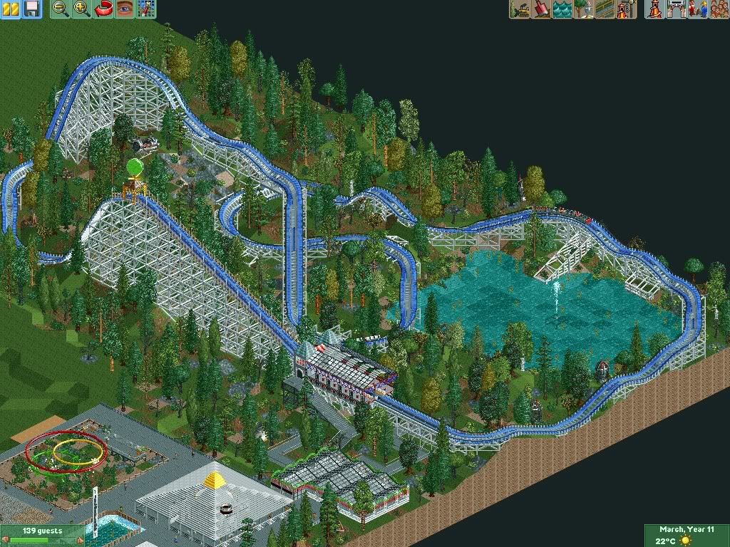
Just thought I would re-post this
The green balloon thingy is a ball of electricity, about the theme, it really is kinda cheesy, but Mid-Size Woodies were popular in the 50s, and so were Cheesy Space Age Stuff. If I load it with scenery, It'll end up like a dark ride, and this ride is mainly about the ride itself, not the scenery like most dark rides. The layout is highly questionable though.Jag - It looks a lot better with foliage. I think a space themed woodie is a quite odd concept though. Especially seeing as it's hardly themed at all, you have a satellite and a futuristic looking station, that's it. And the green balloon does not belong in RCT. Still, it looks better than before.
That exploding phone-booth Cena made is kinda funny. -

 rK_
Offline
i dont know about the layout but your supports look great, but please get the trees of the rock land =(
 -

 K0NG
Offline
That's exactly what I was thinking.......I thought it was at least a bus stop or something.
 -

 Nokia
Offline

not sure if i want to make this a park, desgin, or just landscaping.
basically just practice with foliage & land tiles. -
 Timothy Cross
Offline
we own NE.
*bows to the almighty owners of NE whom he has never heard of and begs for the following request to be mercifully granted*
Pretty please with a cherry on top o' great owners of New Element, shut the hell up.
 Tags
Tags
- No Tags


